
For a portion of last week, v3 of the MTGO client was shut down for a “Spotlight” of the wide beta (Shiny). During this time, players were enticed to participate in the early pre-release of Journey into Nyx exclusively on Shiny. The idea, as I see it, was to put Shiny through the paces as a stand-alone system without the (possible) negative effects of running two clients concurrently. Pre-releases usually generate an uptick in participation on MTGO for many reasons, so this was a great opportunity for WotC to capitalize on that participation uptick and force people to use a client they might be unfamiliar with, perhaps hoping that they enjoy their experience enough to permanently switch. In the least, they anticipate receiving comments and critiques from these players which they can (in theory) use to make improvements to Shiny.
As part of this Spotlight, Chris Kiritz (Digital Business Manager for the MTGO team) published an article highlighting some of the improvements that have recently been implemented in Shiny. Perhaps the most important aspect of this article was noting that the current plan is to switch off v3 in July of this year and make Shiny the only client people can use to access MTGO. This is the first date that we have received to indicate the switch everyone knew would happen eventually. Prior to this article, there was only the specter of the switchover occurring “this year”, but now we have a more definitive date, though there is no exact official date known outside of WotC. Presumably we could see a change anytime between July 1 and July 31.
The performance of Shiny during the Spotlight may play a role in the exact date, and might even cause WotC to push it back to a later date, but let’s assume for a moment that date is set in stone and will not budge; how will this affect Vintage which is set to be released in mid-June?
Remembering the v2-to-v3 Switch
I was not around for the switchover from v2 to v3, but from everything I hear, it was an absolute nightmare, and one that WotC wants to avoid at all costs. We will have to take WotC’s word that there won’t be any issues when everyone makes the switch, but there is certainly no guarantee. The recent spate of crashes certainly doesn’t inspire confidence, even if WotC claims that the recent free ticket events testing out the possibility of returning premier level play (specifically the MOCS) to MTGO were successful.
With Vintage Masters set to release on June 16, there could be as little as 2 full weeks of drafting before the switchover. If there are any complications leading to lengthy downtime, it won’t inspire much confidence in players that may just be getting into MTGO specifically to play Vintage online. Even still, the long standbys waiting years for Vintage to finally arrive on MTGO will not be happy in the least.
Overall, though, a downtime of just a day or two won’t be that significant, especially when considering the importance of the next topic…
Card Appearance on Shiny
It is a well-known fact that Vintage players hold nostalgia in high regard. Paper players spend 10’s of thousands of dollars to build the pimpest Vintage decks possible, seeking out black bordered Alpha/Beta cards and exclusive foils/promos for everything else.
Imagine their surprise when they log into Shiny for the first time and (after getting familiar with the lack of intuitive UI) sit down and participate in their first Vintage Masters draft and see this:
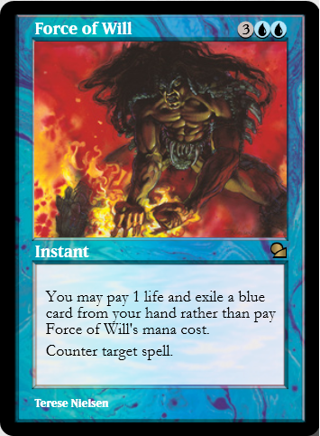
I have a hard time believing that many current paper-only Vintage players will enjoy looking at a Force of Will, especially one that is foil (yes, that is the picture of the unanimated foil version) that looks like that. Even if they didn’t mind that, do you think they’d enjoy looking at this?:
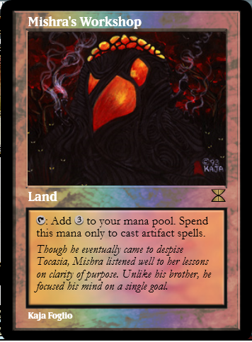
…or this…
…or this — how about this atrocity?…
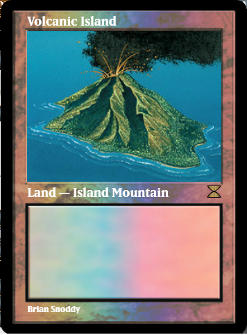
The Masters Edition dual lands are all missing the alternating colored bars inside the text box on Shiny, although the Promo versions of the dual lands in Shiny all have them.
There are other missing aspects of cards in shiny. Let’s again focus on the text box of Vampiric Tutor in this side-by-side comparison:
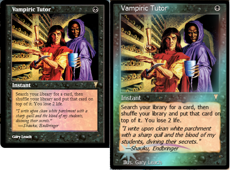
Why is the parchment paper text box replaced with a generic modern card frame box? This applies to all colored cards in their original frame (except blue and artifacts, for some bizarre reason). Green cards don’t have a wooden text box. White cards don’t have a white marbled (?) text box. Red cards don’t have the red stone text box. It may sound trite, but these little things matter! What’s worse is that it can be done since artifacts have their true marbled box and blue cards have their wavy water box (though there is an embossment on the edges which shouldn’t exist in both cases).
Do you think that a player with a $15,000 paper deck and full black-bordered Beta Power is going to appreciate the look of those cards? Even if they don’t immediately recognize that something appears wrong, they will at least initially think that something is “off”. Perhaps they might recognize that there should be some difference between the paper and digital versions of a card, but when you compare Shiny to v3, the differences become even starker, particularly for cards in the original frame (as demonstrated above with Vampiric Tutor).
Chris Kiritz mentioned that the foil process, which has been changed at least once already in Shiny, will be getting a further revamp (hopefully this includes the “swoosh” on pre 8th edition foil cards). Right now, there is almost no discernable difference between foils and non-foils with animations off. Turning animations on makes Shiny even more of a resource-hog than it already is and might make the client unplayable for some users. While the foil process might be getting a long overdue upgrade, there was no mention in Chris Kiritz’s article about any other changes to card appearances on Shiny.
Despite many people complaining about Shiny and how the UI is clunky, among other facets they don’t appreciate (such as the client being a memory hog, which I mentioned above), I posit that most are simply appalled by how ugly cards appear in Shiny when compared to v3 and more importantly to the paper versions of the cards. During the spotlight, several people commented on Twitter about having developed a headache from playing on Shiny; though this is speculative, perhaps it has to do with the card appearance more than the client appearance? In fact, I bet a good number of people wouldn’t mind Shiny if the cards simply looked like v3 but had the same interface/UI that Shiny currently uses. Regardless, any time someone says they get a headache from using a product, it is never a good sign.
Why is the appearance of MTGO significant?
MTGO is a digital representation of playing the actual Magic: the Gathering card game. Part of what makes MTGO special is that the cards have traditionally appeared to be as close to an accurate portrayal of the paper versions as reasonably possible. The cards in v3 strike a near perfect balance of making the cards look authentic and allowing for certain digital enhancements where functionality trumps aesthetics. Yes, v3 is not perfect, but the font in particular is much closer to the actual font on paper cards, which is the biggest issue I have with the appearance of cards in Shiny. Simply using the same font as v3 would probably solve many of the problems!
This is not to say that there are no advantages to changing the digital versions of all the cards. The biggest “feature” is that the current updated oracle text of each card is used, which matters for old cards more than anyone who has only played Standard can imagine. Keeping track of the power/toughness of a Tarmagoyf is easy and convenient. There are many more examples, but with WotC continuing to ignore making changes to the card appearance in Shiny, it seems to imply that it’s not possible to marry the look of old cards and the convenience of being able to revise the text on cards, etc. Why are these things mutually exclusive? Why must we put up with cards that have the wrong font, missing aspects that appear on the paper versions, and ignore things that the v3 client already does so well? The card name and type are in bold for some reason on Shiny. Presumably, the reason for that is because the card name/type would be easier to read, however, v3 doesn’t use bold font and is easier to read than Shiny!
I’m no programmer, but is coding in new font, or using the same font/digital assets found in v3, impossibly difficult? Do these things really take more than a few minutes to update?
On many occasions, people have shared their feelings about the appearance of the cards on Shiny with the folks at WotC. Here are a couple tweets from Jonas Hellstrom (ilsken on MTGO):
@CKiritz @mturian Soon it is 1 year since I posted this. The client still has a long way to go on card looks. #MTGO pic.twitter.com/yoTAO8irMF
— Utvald råvara (@Jonas_Hellstrm) October 8, 2013
Note the date on that first tweet: November 2012. There is a response by WotC indicating that they were aware and had it scheduled to get fixed. It still isn’t fixed. Ilsken even provided a road map as a hotfix for people interested in having the dual lands display properly on their computers (it would still look like it does now for people playing against you unless they perform the same fix on their machines). This hotfix required a modification of 15 numbers, total, which would fix all 20 Masters Edition dual lands.
Changes here and there, but not everywhere
Yet, here we are 19 months since Shiny was opened up as a wide beta and the cards still look as hideous as they did when they first released the client. There have been many updates to the client that are noticeable. While some still complain about crashing, I haven’t noticed as many issues lately. Given enough time in the new client, perhaps those issues would have eventually come up for me. For now, I can’t play on Shiny any more than I have to because the appearance of the cards bothers me too much to put up with all of the other aspects of the client.
I don’t want to sound completely opposed to Shiny as there are some useful upgrades over v3.
- Drafting in particular (which just so happens to be the biggest source of income for WotC from MTGO) has the unique benefit of building your draft deck while you are still drafting.
- The “red zone” is an effective way to indicate that a creature is attacking when compared to v3.
- There is a help page with the key bindings/shortcuts for Shiny that was never available on v3 and hidden in some obscure page on WotC’s website, if you knew it even existed.
- Highlighting targets on the battlefield and the stack is much easier to read than the arrow system in v3 when there are more than two active targets.
- You can access sample hands in the deck builder to get a quick feel for how the deck works, which is much easier than setting up a 1-player solitaire match in v3.
Overall, though, it doesn’t feel like Shiny is much of a feature-rich upgrade over v3. When you factor in the negative aspects (of which there are many beyond just the appearance of the cards), the need to switch to Shiny raises serious questions.
What can we do?
Unfortunately, there isn’t much more that we can do other than fill out the feedback forms for Shiny and hope that they address our concerns in the near future. I’ve filled out a handful of these and noted my concerns over the card appearance, but clearly that was not enough. We need more people to submit their feedback in hopes that it finally catches their attention.
Remember to provide constructive feedback when writing to WotC. Profanity, name calling, asking for heads to roll, and incoherent gibberish will not get their attention. If you convey your thoughts and point out who this could negatively affect things like participation in Vintage Masters events and the like is the best way to effectively communicate our concerns.
Circling back around to Vintage
One can hope that the card appearance on Shiny can be fixed in time for the release of Vintage Masters. If it’s not, and v3 is turned off shortly after its release, we could have a major problem on our hands.
If enough people either bail out and/or lose interest in online Vintage because of the card appearance, there may be a chain of events that basically make Vintage D.O.A. online. Assuming enough people decide to wait it out and avoid investing until the card appearance is fixed and that doesn’t happen during the time that Vintage Masters is available to draft, we could have serious supply issues with Power. If not enough Power is opened to support any sort of growth in the player base, it won’t matter if WotC fixes the card appearance in August of 2014 or August of 2017; the card prices will be so high that many people would just avoid playing Vintage altogether.
It’s not as if there is no alternative for Vintage players to test out new decks from the comfort of their own computer. I’m not going to advertise the name of this program, though I suspect many people reading this are already aware of its existence. Many Vintage players have used this program for years and would simply fall back to using it if Vintage on MTGO didn’t work out. As is, there is already going to be a tough battle to convince those Vintage players to actually spend money on MTGO when such an option is already available. If this (nearly) free program can make cards look no worse than MTGO, there is a huge problem.
Clearly this is the doomsday scenario. Maybe it’s an overreaction on my part to believe that this chain of events could actually happen, but we need to do everything we can to make sure that this situation is avoided. Please share your thoughts with WotC!
enderfall
Clan Magic Eternal
Follow me on Twitter @enderfall
Thanks for addressing this! I have been “working” for better cards in both v3 and v4 for some time and It’s good to see that other players are concerned. People complain about the look of the client, but I say that the cards are equally, if not more, important.
Just want to be clear, while I wrote that players may see card X when opening Vintage Masters, this doesn’t mean those cards are in Vintage Masters. I wrote this before learning about this week being VM Preview Week, thus any discussion regarding what cards are in VM is pure coincidence. Sorry for any confusion!
very apropos, thanks for writing this.