
As we come to the close of the solo BFZ limited format, it’s time to look back. Which cards aligned our hedron networks, and which went horrible awry? Put your <> hedrons <> in the sky! It’s time for our Battle for Zendikar flavor retrospective.
Special Achievements in Art
Nostalgia Award
Jesse K: To me the absolutely most disappointing thing about Battle for Zendikar is that it wasn’t a return to the original’s pulp adventure/Indiana Jones flavor. Gone are the traps, the relics, the adventuring gear, the expeditions, all in favor of telling a story about the little guys banding together to take on the overwhelming evil. Regardless of how well this story is done, it’s a bummer that we’re rehashing one of the most common Magic stories instead of taking another crack at a top-down flavor-based world. Imagine if Return to Innistrad didn’t have any horror flavor and instead was just about, I don’t know, Phyrexians fighting angels. The art on these cards captures some of what I loved about the original Zendikar and shows that as a world, it still contains notes of exploration and wonder.
Jesse T: Zendikar was great back in the day. There used to be this place in Coralhelm that had amazing kraken paella, but now all of my favorite restaurants have been hollowed out by the Eldrazi and turned into cookie-cutter chains of brittle bone-like dust. Someone needs to stuff them back inside the Ark of the Covenant or whatever. Not only are they boring generic evil, but Zendikar is in complete upheaval because of them. It’s such a convoluted mess of unrelated ideas and random characters that it might as well be (and very well may be) cobbled together from the creative team’s favorite D&D campaigns.
The “I Spit on Your Grave” Award for Least Attention Paid to Predecessor’s Flavor
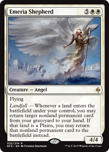
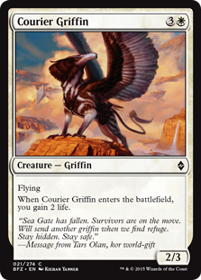
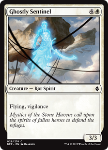
K: All the angels in this set have the familiar halo around the eyes look that was so distinctive in the original set. At first this might look like good attention to detail, but actually these halos were lost once the Eldrazi were freed in Rise. Why they’re back again now I haven’t seen any attempt to even explain. A cool visualization, sure, but not worth it to completely retcon an element of original Zendikar’s story. Quick props to this card, however, for being a sly reference to Emeria, the Sky Ruin, in both its effect and in caring about Plains.
T: Halos, no halos, who even knows anymore? Keeping track of angel fashion trends is harder than hunting down a wily gnarlid on a misty night in the Vastwood. My theory is that their halos are like Google Glass so they can stay on Snapchat 24 hours a day. At least they’re not wearing those ridiculous bell-bottoms anymore.
Weirdest Dude Award
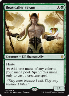
K: Honestly there were a lot of ways this award could’ve been worded: Best Evocation of a Greasy Ponytail, Best Reference to a Good Card on a Bad Card (check out that Lotus Cobra), Best Celebrity Impersonator (take your pick, I’ve heard comparisons to everyone from Steven Seagal, to Tommy Wiseau of The Room, to former Republican vice presidential nominee Paul Ryan). No matter what, I think we can all agree that this is an off-putting, weird guy. Baffling choices abound in this card, but I think the overall look is what’s worst. How can he be so buff, but only be a 1/1? Art matters, folks. If this guy weren’t so ridiculous, I think I’d like him a lot more.
T: It’s gotta be a real bummer when you spend that much time working out and you still just look like a slightly damp pervert with a creepy pet snake. You live outdoors, dude. Why are you so pale? I almost thought you were an Eldrazi or something with that lumpy bone-colored thorax. Who wears two belts and no shirt? If you’re such a good listener, you need to start listening to some of that angelic fashion advice.
Most Overused Visual Trope Award
It’s a tie! between…
Dust
and Hedrons!
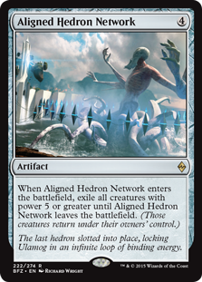
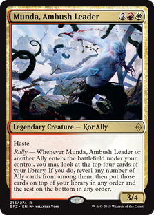
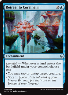
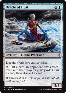
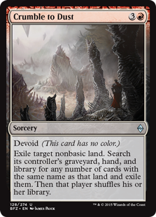
K: I get it, the Eldrazi turn whatever they touch into dust, that’s cool, and a good representation of playing with the exile zone. Similarly, hedrons are a defining characteristic of the plane and are important story notes. Plus, they look cool and mysterious. Sure, these are good things, but boy do they show up in a lot of art. I’m not going to go through and count, but I think probably as many as half the cards in this set have a hedron or some dust chilling somewhere in the background, like maybe we’ll forget we’re on Zendikar if we don’t see one every other card as we fan through a pack. It also doesn’t help that we’ve been exposed to hedrons before, and everything is less cool the second time. And it doubly doesn’t help that both of these visual elements are various shades of gray. Special recognition to Munda up there, who even has hedron tats. Does that do anything for you vs. the Eldrazi? Should I draw a clove of garlic on my arm if I’m fighting vampires?
T: I feel kind of bad for Oracle of Dust. It’s like being the Aquaman of the Eldrazi. What’s your power? Oh, you talk to dust? Wack. Check out Munda (whom the Wizards of the Coast legal department would once again like to remind you is easily distinguishable from God of War’s Kratos in many plausible ways)! He hates the Eldrazi so much that he’s got hedrons on his hedrons! He’s one bad-ass dude you don’t want to mess with, especially not in court. Aligned Hedron Network, by the way, wins the dubious secondary honor of having the most hedrons in a single piece of card art. Congratulations to Richard Wright for drawing all those little diamonds!
The “It’s Coming Right At Me!” Award for Overuse of 3D Effects
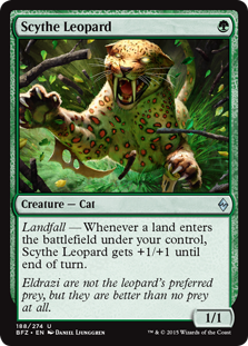
T: It’s amazing that evolutionary selection hasn’t weeded out arm scythes as a genetic trait despite the alarming rate of self-impalement among Zendikar’s leopards. The same goes for Eldrazi and being inside-out.
Creepiest Eldrazi
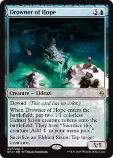
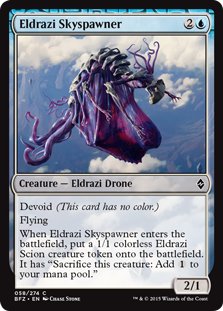
K: Although it’s not the theme I would’ve chosen for returning to Zendikar, what they’ve staked this set’s effectiveness on is the Eldrazi being really creepy and weird. As such, I thought it would be a good idea to look at some of the set’s best and worst giant spaghetti monsters. On a macro level, one thing I will say is that I enjoy how they took art direction from each of the big three, creating unique ‘broods’ that have distinctive characteristics. Unfortunately, this set being so Ulamog-heavy means we’re getting to see a lot of dust and a lot of extraneous arms, and not much else. Was one Eldrazi really enough to sustain this set, when the original had 3? Regardless, my favorite Eldrazi art of the set does belong to the Ula-monsters. I think Drowner of Hope does the best work as far as establishing mood and scale. Forget perspective birds, we’ve got perspective houses. I also like how the creeping hidden horror is about to run rampant on the unexpecting peaceful town. This kind of framing makes the battle feel important and appropriately frightening. I’m a big fan of the use of color here as well. Eldrazi Skyspawner is included among my favorites because it’s just so gross and creepy. It might look at first glance like this guy is keeping himself aloft with wings, but no, that’s actually a big gross birthing sack with a fetal Eldrazi inside it.
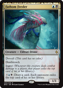
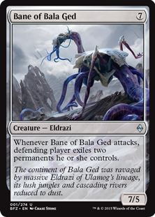
T: Ah, the miracle of birth: When a gestating bundle of joy ruptures the amniotic sac and slimes its way into the world with nothing but a nutrient-rich placenta at its side. Actually, do the Eldrazi have placentas? What do they do with their placentas? What did I do with my placenta? Where is it? I just had it a second ago. Anyway, Eldrazi are gross, and Skyspawner is right up there with Bane of Bala Ged and its veiny purple sausage tail. They did a really good job of making these things look disturbing and wrong in creative ways. Fathom Feeder makes the list for none of those reasons, but rather for looking like a colorshifted mecha suit from Neon Genesis Evangelion. Nice!
Least Scary Eldrazi
K: There was an embarrassment of riches to choose from here, emphasis on the embarrassment. We’ve got to choose here between a walking lectern, a noodle worm that appears to have let himself go a little, and what appears to just be a straight-up ant. I hate ants more than most people, but the threat of ants is really more in the numbers. This could’ve been a cool concept if there were a bunch of little Eldrazi that looked like this, kinda just swarming around. With Eldrazi like this, it’s no wonder that the D-grade sliver knock-offs that are allies are putting up such a fight.
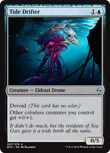
T: Shout out to Tide Drifter not doing much.
Best Impersonation of a Paramite
T:
Her cards all branded with elven face,
This hero may free our plot from Jace.
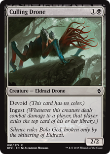
From hands of blue and Culling Drones,
Only she can save our exile zones.
Google esoteric joke,
Joraga Nation be doomed to croak.
Most Unnecessarily Literal Artwork

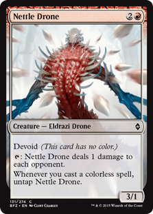
K: I’ve never been a fan of cards that depict their spell too literally, like the common trope of a blue card that draws three having three glowing balls of light in it, or when your damage spell shows 2 lightning bolts to indicate that it does 2 damage. It feels a little patronizing, like otherwise we wouldn’t get it. I do like how this is the unusual card that puts you in the first-person perspective of the spell caster (or in this place tentacle owner).
T: That is such unrealistically perfect aim! Do you know how hard it is to chain three enemies together with one tentacle? Try impossible! Personally, I love it when cards depict their spells too literally. Yes it’s patronizing, but it also saves time during booster draft because I can just flip through the pack and pick out the best pictures. Between this and Touch of the Void, it looks like tentacles must be what Zendikar has instead of fire or lightning.
Least Literal Artwork
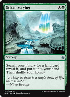
K: No elves, no scrying, not even any woodlands. Aside from showing something that could be described as a land, the art has nothing to do with the name or effect. What this card does offer is a rainbow waterfall and stream winding through a tranquil dustscape. Sure, why not. Seeing this card makes me wonder if it wasn’t just repurposed concept art.
T: To be fair, the original artwork wasn’t much better. At least this one is clearly a noncreature spell of some kind and not, say, a robotic elf. On the hot/cold scale, I’d say we’re at about Jwar Isle as opposed to Sejiri, which is to say, only slightly less cold. Step up your Zendikography game, people. You don’t want to fail to find.
The Hunt the Weak Commemorative Worst Art Award (aka. “The Huntie”)
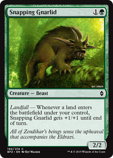
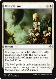
K: With how much green has been maligned in this set, there have been many theories about why it’s so bad. People blame the unthemed nature of the cards, the way they stack up poorly against the large colorless monsters of this set, or the fact that this set’s ‘fight’ card is probably the worst we’ve seen. I’d like to plant the blame on Snapping Gnarlid, who just looks ridiculous and silly in every way. It’s like the artist started with a form that looked kinda bad and tried to make it more threatening by adding more and more features, all of which only exacerbated the problem. Nice tree he’s sitting in, though. If the premier green 2-drop of the format is too embarrassing to put in your deck, you might have a problem. I’m also highlighting Unified Front because 1) It looks like the artist accidentally just illustrated a land and the subject of the card had to be photoshopped in hastily at the last minute, and 2) What is that thing the lead Kor is holding? This might not be a reasonable criticism, maybe it’ll be obvious when someone points it out to me. As of now I see… Maybe a poorly formed vase? A sticky gob of honey?
T: I think it’s an Eldrazi skull, which could easily be described as looking similar to either of those things. The real story here is Snapping Gnarlid, depicted in truly miserable fashion as the misbegotten child of the Tasmanian Devil and Manic the Hedgehog. This miserable creature isn’t agitated by the presence of the Eldrazi, it’s angry at God for giving it that face. Mind you, this is in a world with inside-out afterbirth monsters. It looks like it’s about to leap over into the Unified Front artwork because it’s either 1) trying to hide its horrifying visage behind the relatively benign featurelessness of a severed Eldrazi head, or 2) also theorizing that might be delicious honey after all.
Best Nonland Art
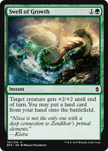
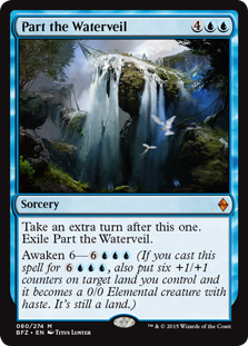

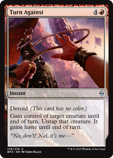
K: It’s an odd choice for a favorite in this set since I was just complaining about the first-person perspective on Nettle Drone et al., but I really like the total package on Turn Against. It crams a lot of detail and flavor into one little square, and as a bonus has the adventure flavor that so much of the set sorely lacks for me. I also like Swell of Growth as the rare pump spell that I feel is both beautiful and dynamic. Check out that stormy sky!
T: Does Part the Waterveil count as nonland? Well, in any case, you can see why they’re excluded from the competition. Breathtaking! Drowner of Hope gets to return for a victory lap, not because of the giant shadowy tadpoles this time, but because of the pristine teal waters and sun-drenched sand that literally rival Super Mario Sunshine in their beauty.
Best Land Art
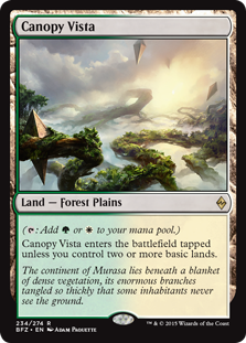
K: Really all the lands look great, so it’s a matter of personal perspective. I love Canopy Vista’s meandering landscape of roots, hedrons, and fog. It’s also got a cool sunset thing going on, lending a kind of magic-hour light and shadow to the whole scene. By the way, we’re not considering the expeditions or basic lands for this category, because that’s an article for another day.
T: That’s right, we’re the land guys now. Get used to it! There should be plenty to say about them too now that Wastes has been spoiled, but I can’t talk about the future yet, or I might create a time paradox. Just chill and look at that beautiful Canopy Vista. Imagine sipping a full-bodied Pelakka blend on the wooden outdoor deck of your very own hedron bungalow. I’ve been looking into some of those deckbuilding ads that pop up during videos sometimes, and it’s a surprisingly rewarding hobby! In fact, I bet property costs in Zendikar are really low right now because of the whole Eldrazi thing. This could be Ob Nixilis’ opportunity to corner the entire housing market.
Special Achievements in Flavor Text
Largest Gulf Between Flavor Text and Card Art
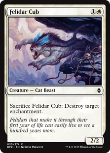
K: Pictured here: The alternative to making it through their first year, a.k.a. leaping off a cliff. Why does this cat dying young affect enchantments? Seems like a perfect question for flavor text to have answered.
T: My guess is that it’s because they fling themselves onto hedrons and explode. I’ve seen newborns running off the cliffs in droves like lemmings, pouncing on hedrons like giant Toblerones and vaporizing on impact. Cubs that learn to distinguish between food and simple geometric shapes at a young age increase their chances of survival dramatically, but they become useless in battle against Hedron Scrabblers.
The Jaya Ballard Award for Quippin’est Quip
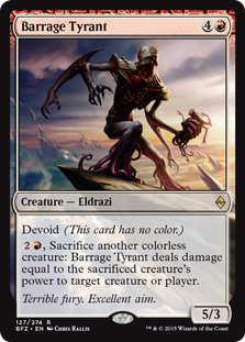
K: These both got chuckles out of me, or at least an appreciative nod, so they’re successful in my book. I especially like how Barrage Tyrant’s name, art, and flavor text work so well together to really evoke an image. Sometimes the scariest thing an otherworldly horror can do is be flung right at you.
T: Now that’s what I call ‘quipment!
The Gustha Ebbasdotter Award for the Opposite of a Good Quip
K: Unfortunately good jokes don’t grow on trees.
T: Yo dawg, I heard you like trees…
Best Name
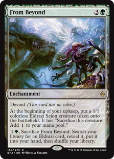
K: Short phrases continue to be a great place to find unique and evocative names. The days of snappy one-worders like ‘erase’ and ‘fireball’ may be behind us, but they’ve recently gotten so much better at naming things. I can imagine a time not too long ago when From Beyond would’ve been Murasa Spawnpit or some other fantasy-word soup. Well done, naming department.
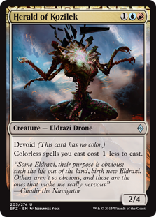
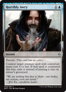
T: I noticed this trend starting with scheme cards in the Archenemy supplemental products, with names like Every Hope Shall Vanish or Behold the Power of Destruction. My only complaint is that we’ll never see any of these names again because they all have the devoid keyword.
Special Achievement in World Building
K: Two concepts here that really came through for me in the flavor text throughout the set. I like the storyline of the vampires joining forces with the humans to fight off the greater threat, and the humans’ persistent unease with this alliance. I also enjoy the whole component of the land fighting back. If anything was established in the first Zendikar block it was that it was a plane characterized by strong and tumultuous elemental forces, and it makes sense to tie that in with the battle against the Eldrazi. Maybe another plane wouldn’t have stood as much of a chance. These kinds of interesting wrinkles make an otherwise straightforward story feel more unique and fully realized.
T: Nice try, vampires. Sure, your “hospital” needs donations for its “blood bank” so it can perform “transfusions” on “patients.” Next you’ll be telling me I should sign up to become an organ donor or register to vote. Don’t kid yourself. Voting! Biggest and most obvious vampire scam of all time.
The Twelve of One, a Dozen of the Other Award

K: One of my least favorite flavor text tropes is when they assign an adjective to each side of the central conflict, and the flavor text would be essentially unchanged if you switched them. Quick, cover the card, are the Eldrazi relentless or ruthless? Aren’t they both? Terrible.
T: The flavor text may be terrible, but the Eldrazi are horrible.
Throwback Award
K: Ay! It’s Bruse Tarl, our favorite animal-insulting nomad! It doesn’t make either flavor text less bizarre, but it’s nice to see that such an odd character is getting a little shout out here.
T: The colorful, opinionated name-calling of magical beasts is a weird niche, but if we can find one, I’m sure Bruse Tarl will too one day.
Least Bad Zombie
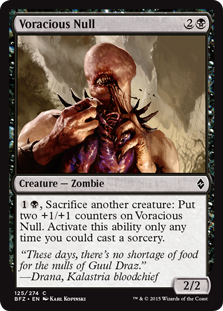
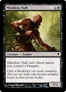
K: Wow, nulls have gotten a lot more impressive since the Eldrazi invasion. It’s nice to see a revisit to one of the more conceptually interesting zombies we’ve seen (and by the same artist no less).
T: I remember when the only faceless all-devouring evil you had to worry about was the old familiar faceless all-devouring evil next door. Simpler zombies from a simpler time. One day we’ll all look back on this Ulamog business and laugh, because we’ll all either be dead or insane.
Most Foreshadowed Story Twist

K: Guys, do you think Kozilek might be involved somewhere in this block’s storyline? I don’t know, I mean they’ve said there’s only one Eldrazi around these days. I would be shocked, SHOCKED to find that kind of switcheroo pulled on us.
T: Please be advised, Kozilek’s Channeler is not a universal remote! It has the word “channel” in its name, but it did not work with my TV. In fact, it tried to shove a slab of obsidian-like glass through my chest and drown me in my own mana pool. I contacted the seller, who replaced it with a set of Tide Drifters at no additional charge. They are working perfectly, and don’t even need batteries! A+
Best Flavor Text
K: As a means of telling the main story of the block, I prefer the story of Sea Gate to many recent attempts. The ponderous Theriad comes to mind immediately, and Sarkhan’s bogus journey wasn’t much better. The quotes often have a History Channel “war is hell” vibe to them, and the fall and retaking of Sea Gate sets the stakes and the scale just right to get you to care about what’s going on. I think the reason this flavor text succeeded for me when others have failed is just that they get specific and describe the conflict, rather than trying generically to invoke it.
T: I’d like this storyline a lot better if it didn’t feature the game’s two most boring characters. Everyone loves a good siegin’ story! Imagine how much better it would have been if Gideon were more than a roughly man-shaped sack of good-aligned meat. I think the real tragedy at Sea Gate was that they lost all those library books. No offense to any of the people who died.
The Ancient Grudge Commemorative Worst Flavor Text Award (a.k.a. The Grudgie)
K: I just rolled my eyes so hard that they fell out of my head and turned into dust, just like everything else in this set. The idea they’re trying to communicate here is so simple and easy to communicate, and yet they just kept going. And yet it ends with the supremely lazy “a dozen other poisonous species”. How can something be too detailed and too vague at the same time?
T: Not to mention that basilisk marrow is only poisonous when cooked incorrectly. They don’t even cite any primary sources! This flavor text is clearly just trying to cover up shoddy research and lack of substance. Trust me, I’m an expert.
Runner-Up
K: After they’ve spent so much time and effort establishing the threat of the Eldrazi, why include a piece of flavor text that undercuts it? I guess we’re supposed to assume that this guy is a braggadocious idiot. Good thing we get to hear from him on flavor text, in that case.
T: Just another poseur trying to start a celebrity beef with Ulamog. I’d love to see this guy try to beat up Ulamog and take whatever unholy appendage the Eldrazi have in place of a wallet, mostly because he’d be saying “Foolamog” the whole time like he was the only person ever to think of it.
Special Achievements in Design
The OCD Award for Pattern Completion
K: Oh god, I’m so glad they did this. I guess the question is how long until we have an artifact that taps for 4 mana and sacrifices for 4 cards. The only snag here for me is that stupid, smug Jace quote. You know what, I’m just going to say it: Can we have a storyline where Jace dies, please? I can’t be the only one who wants this.
T: It would’ve been a nice sendoff: To Jace, for his bravery and sacrifice at Sea Gate. The Living Guildpact unfortunately goes on living. I’d settle for a storyline where he doesn’t cost $300.
The Switcheroo Award
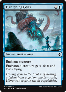
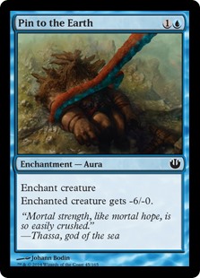
K: Whoops! Pin to the Earth doesn’t pin to the earth, yet Tightening Coils do. Also, one of these two cards involves Thassa’s Bident, and the other one directly references it in the flavor text. I guess we’re supposed to draw the conclusion that Kiora is mastering Thassa’s powers, but the fact that these two names and arts could be swapped and make more flavor sense is what sticks out to me even more.
T: Now, hear me out– A lot of people have been bagging on these two cards for some reason. What if a creature had a really long tail? Pinning It to the Earth wouldn’t stop it from flying, but reeling it in with Tightening Coils would. And what if you were fighting an Opposite Elemental, where nothing worked the way it was supposed to? Actually, that’s a pretty ludicrous argument. It makes about as much sense as getting Pinned to the Earth by the god of the sea. Or does it? Checkmate.
Biggest Gap Between Card Concept and Mechanics
K: Doesn’t this look and sound like it wants to have something to do with like, I don’t know, controlling another creature? If that thing is on my head, I would feel pretty lucky if the only thing it cost me was 2 life. With such a great name and concept, it’s too bad the mechanics couldn’t deliver.
T: Clearly this is supposed to be a headcrab, but it just comes pre-attached to a random 3/2 body for no reason. This would have been way cooler at a higher rarity as some kind of Mind Control or Zombify effect. As-is, the only thing it’s really evoking in me is the urge to blow it apart with a gravity gun. [Editor’s note: Um... don’t you mean "zero-point energy field manipulator"? –PlanetWalls]
Most Left-Field Reprint
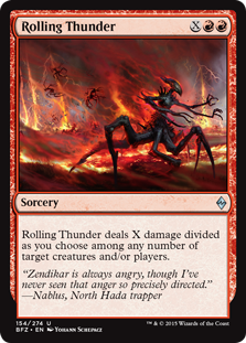
K: Jesus, who asked for this? This card is so notoriously terrible for a limited format that it’s probably the first thing people think about when Tempest draft is brought up. It’s rare that one card does so much to undo a positive limited experience (lookin’ at you, Sprout Swarm), and it’s utterly baffling that anyone would want it back in any capacity. I get it, it’s not as good as it would usually be, because there’s all sorts of big guys. It’s still too good, and I see no compelling reason for it to be reprinted at all.
T: Where is the thunder, exactly? I see lots of fire, and a skittering mass of unidentifiable insectoid limbs, but I don’t even see thunderclouds, just smoke. How does this fit in with all those other tentacle-based burn spells? Speaking of which, I think I’ve seen that charred alien corpse on an episode of The X-Files. That’s a converted mana cost pun, for those of you keeping score at home. It got struck by lightning while crossing a railroad.
Reprint Most in Need of New Art
K: Reprinting old, beloved rares is cool, and I fully support tanking the price of casual all stars like this guy and his mythic counterpart, Dragonmaster Outcast. However, when you don’t even bother to change the art up, it feels kind of random. Don’t get me wrong, it’s still good art. I just wish it were bringing something new to the table, maybe to highlight how the plane has changed since the last time we were here.
T: Maybe they could put some dust around it? Or Felidar Cubs raining down onto enchantments in the background? Or both!
The “Why Isn’t This an Ally?” Award for Most Confusing Typeline
K: Hoo boy, this is a can of worms. By now everyone’s talked it to death, so I’m not going to go into too much detail. I get the gameplay reasoning of slapping the ally creature type on a whole bunch of cards, and it even makes some flavor sense. All I’ll say is I wish there were some kind of flavor or artistic indicator of what is an ally and what isn’t. These two guys up here have flavor text that directly mentions that they’re involved in this fight too. Did they just not pay their ally dues, so their membership lapsed?
T: Hey! Being an ally is something you actively do, not some label you throw around when you need to trigger enters-the-battlefield abilities. These folks have the right idea. It doesn’t matter what your creature type is, as long as you fight for what’s right when it counts. Soar high on your wings of moral righteousness, cousins!
Worst Design
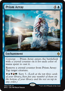
K: The semi-clunky execution of ingesters and processors was going to be my pick here, and then I remembered that this ridiculous card exists. Everything about it is slightly wrong and unintuitive. It reminds me of those AI-designed cards that you see popping up on the Internet sometimes, all it’s missing is a ‘tromple’ keyword. The number of changes you’d have to make to have this card make sense is too large to go into fully here. This card is also a nice centerpiece of the failure of the converge mechanic. Frankly, almost nothing that has it is particularly exciting. You put this card out there for all five colors, and what do you get? Something significantly worse than Sleep. And this is a rare! Scrying 3 every turn is powerful, sure, but compare it to what else you can get for WUBRG. I guess this is a top-down design, but a top-down design of what?
T: This card is truly outrageous. Truly, truly, truly outrageous. Crystal counters seem to imply that there’s some significance to them that generic charge counters simply couldn’t convey. The only thing I can possibly imagine is that this once made sense long ago, but it was tweaked and twisted so many times in development that it became a perverse mirror image of its former self. Now it wanders the multiverse, making no flavor or gameplay sense whatsoever, as a stern warning to those who would dare to build around it.
The Golden Hedron Award for Best Design
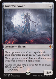
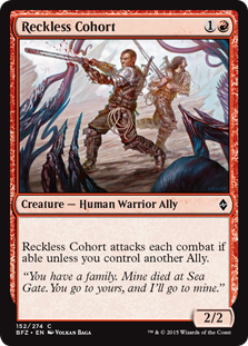
K: I really think the best top-down design in this set comes from a bad red 2-drop. So many cards have had rules text like this, but never has such a compelling reasoning been attached to it. It even makes the tacked-on ally creature type seem suddenly meaningful. How many Magic cards evoke desperation so effectively? Void Winnower also deserves special praise, since it captures the Eldrazi’s strange and otherworldly nature better than any other card in the set. I’m glad they kept “oddness matters” off the rest of the cards, but having one that cares about it makes perfect sense. I hope in the future we see more Eldrazi with bizarre, left-field rules text like this.
T: So, the Eldrazi know what converted mana costs are. What else do they know about Magic cards? Number of characters in the text box? Collector’s number? Are they self-aware?? Void Winnower almost feels like something from Unglued, which is fitting for the horrible un-gods that are the Eldrazi. The name and flavor text are complete misses, but it explores some really interesting design space, and it’s easily the most unique card in the set. Reckless Cohort, on the other hand, is the glue that binds the set together, and a much stronger package overall. Which one deserves the coveted Golden Hedron? Eldrazi or allies? Let’s hold out and see who’s alive after Oath of the Gatewatch. Getting this trophy engraved was expensive, and I’d hate to waste it on a dead guy. No offense to anyone who’s going to die. Thanks for reading!
You can find the Two Jesses on Twitter @TwoJesses.
Hahaha, Felidar Cub!
This article is pure gold and has been a delicious treat to read. Thank you, guys!