
Part Two of the flavor review is out just in time for Dragons of Tarkir’s Magic Online release. You should have plenty of time to read all about which cards have the best and worst art and flavor text in between click lag and client crashes.
Ugin, the Spirit Dragon: *Yawns* I just woke up after a loooong nap in a hedron cocoon, and boy am I sleepy! Last time I was here, I was a spooky dragon ghost, but I guess now I’m alive. Things sure have changed in the last thousand years here on Tarkir, but I guess I wouldn’t know that, since that timeline doesn’t exist now… which means I never would’ve spoken to Sarkhan and influenced him to travel back in time to save me… Time paradoxes sure are confusing, but fortunately most of these differences have manifested as specific characters being slightly more or less important and/or dead than they used to be. Let’s take a look at some of the other things that have changed about my beloved Tarkir.
Sorin Markov: Fudge that! Grab some breakfast, and follow me to Zendikar! We’ve got Eldrazi to deal with. Leave the writing of flavor reviews for mortal kind. Jesse K! Jesse T! Make silly commentary on these cards or I shall exsanguinate you!
Catch up with the gang’s comments on legends, planeswalkers, and dragons here in part 1.
Timeshift!
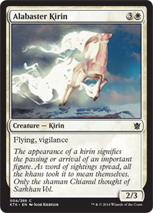
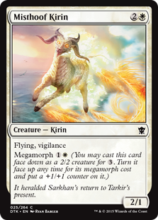
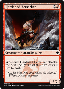
K: Thanks to the increased presence of dragons on Tarkir, kirins have had to adapt by evolving super sweet fire trails and glowy red eyes. Aside from the local wildlife’s increased interest in death metal, the change in Tarkir here is shown by having the stats be switched around, from 2/3 to (usually) 3/2. Everything is topsy-turvy!
T: It’s out with the old, and in with the new. This season, Tarkir’s hottest keyword is makeover! We took your old kirin, fixed up the engine, and added some stylish custom flame decals. When you show up to the wizard battle with this bad boy, shaman Chianul definitely won’t be the only person whose head you turn!
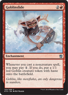
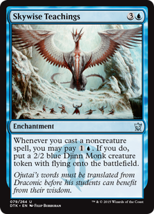
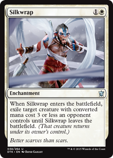
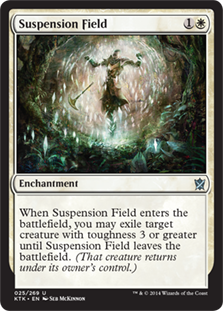
K: So here’s an example of the kind of parallel that they’re drawing between the worlds that doesn’t really work for me. These cards are clearly supposed to echo one another, but what are they actually saying? That with the presence of a dragon, you get better results from casting spells? That the Jeskai are better off without red? It doesn’t help that Goblinslide’s flavor (i.e., how exactly you get a goblin out of playing a spell) never made that much sense in the first place, and certainly doesn’t invite comparison to whatever is going on in Skywise Teachings. Generally speaking, there are a lot of cards like this, where there’s some kind of parallel that can be drawn, but it makes little enough flavor impact that I’m not going to cover it. For another example of this see Suspension Field vs. Silkwrap.
T: Better djinns than ‘lins. If your opponent’s creatures are giving you trouble, you can always try knitting them something nice. Ojutai’s realm of ice and snow can be pretty chilly, and they’ll be so grateful, they might not even attack you!
K: This is more what I’m looking to see from my time travel-themed block! These cards communicate something about the change in the power dynamic and the effects of the time travel muckery on Tarkir’s various denizens.
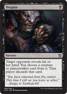
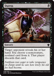
T: Here we get a rare glimpse of Sarkhan in dragon form. Just look at him cow Zurgo into submission! I’m not sure what’s inside of his mouth, but it appears to be cotton candy, which is one breath weapon I could definitely get behind.
K: I have a somewhat different interpretation of this picture– to me it looks like Zurgo is being chewed out (soon to be literally?) by his dragonlord, Kolaghan. This does make the parallel between Duress and Despise weaker, and calls into question what Sarkhan is doing on this flavor text, but it still fits. Zurgo once was the source of the discard spell, now he’s the target.
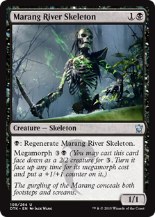
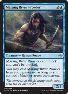
K: Oh look, Jesse T, it’s your favorite card from Fate Reforged. It seems our old River Prowler is still prowling around, although he seems to have lost a bit of weight. I like that the Marang River has retained its apparent regenerative properties. This is a subtle enough allusion that it rewards weirdos like us who look closely at cards from a flavor perspective.
T: Marang River Prowler has gone from tasteless to faceless! Not only has he become ambidextrous in death, but he’s got a brand new skull to match the ones on that tacky prop from a cannibal exploitation film that he still wears around his neck. Just in case you’re not sure what a 1,000-year-old skeleton smells like, the artist has been kind enough to include big green stink lines.
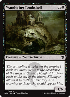
K: As someone who literally lies on a big pile of money, Silumgar’s got some nerve complaining about “the decadence of the ancient Sultai”. It’s interesting that a zombie turtle appears to move more quickly than its living counterpart. I guess it’s enough to be reminded of him, but it’s a little disappointing that one of my flavor favorites from Khans has turned into a vanilla common. Does this communicate something about the changes to Tarkir as well? There’s probably some kind of extended metaphor available about a different timeline in which Magic still has manaburn, damage on the stack, and the old card frames, but I think that kind of meta commentary was ixnayed after Time Spiral Block.
T: So, in this metaphor, I’m supposed to be Sarkhan, and the pre-M10 rules are supposed to be dragons? That’s ridiculous. I’m not obsessed with the past like that. Things were just actually more awesome when we were kids. Like that time the Zombie Turtles fought the Ninja Turtles. Remember that? Turtle toughness is no match for turtle power!
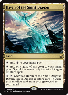
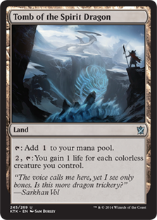
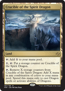
K: These cards show an impressive dedication to depicting the same location in three different lights over the three sets. This triptych is one of the most effective tools for communicating the whole theme and story of the block. I do wish we’d gotten a different quote from Sarkhan on each one, but I guess these are some cards that mainly communicate flavor using the rules text, which is something I’m generally in favor of.
T: I would’ve loved some new flavor text too, but how much dragon trickery can we really handle? With a nearly unlimited budget, and almost no scheduling concerns, I’m actually a little disappointed with the renovations Ugin’s made here. I don’t even see a single piece of furniture in his fixed-up haven. Has he just been living like a twenty-something bachelor all this time?
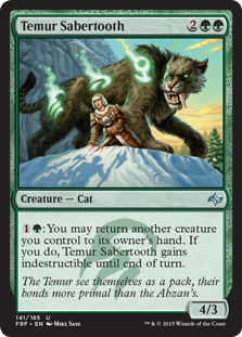
K: I want to talk a little bit about the little ways in which Tarkir appears to have changed that you might not have noticed. Sure, we can all tell that in the new timeline dragons rule and khans drool, but did you notice that sabertooths (saberteeth?) appear to have survived into the present in Dragons, but not in Khans? Conversely, there are no mammoths or loxodon in the Dragons world, while they were fairly prominent back in Khans. What is the reason for changes like this? Did the dragons hunt certain animals to extinction, making it possible for others to thrive? It’s possible that there’s no explanation at all, and that the small changes in creature representation are a coincidence, but I wouldn’t be surprised if someone put some thought into this.
T: With all its mammoths and sabreteeths, I’d give Tarkir a C+ for pre-historic mammals. I’m still looking forward to seeing brontotheriums, toxodons, and giant pangolins in a future block. The current theory about the notable absence of these creatures, along with dinosaurs of all kinds, is that they’re all sleeping safely inside of healing cubes, as predicted by L. Ron Hubbard.
K: So I just finished giving props for the subtlety with which some of the changes were handled, and the very next thing we come across is this card. I do not think this is the kind of flavor anyone needed. We all know there are dragons now, we don’t need them photoshopped into every rando common from Khans. All I can say is that I hope the artist wasn’t paid for this twice.
T: Hey, Magic fans! See if your friends can spot the difference with this cool optical illusion!
K: It was in Khans, now it’s in Dragons! Things are different! Aside from having some of the silliest art in the set, this again feels like a completely unnecessary parallel. At least the arts are actually different. I like exactly one thing about this printing, and that’s that it hints at a continuing rivalry between Bolas and Ugin that I’m looking forward to seeing play out.
T: Here we go again! Ugin looks unfortunately muppet-like here. My biggest complaint, however, is that they didn’t go deep enough down this rabbit hole. Who’s inside Nicol Bolas’s head? Who’s inside that character’s head? And that character? The answer, of course, is Zombie Turtles all the way down.

K: This is what I was talking about on Sabertooth. Subtle changes. Temur no longer gets bear companions, because Atarka eats them all. What a jerk. In fact, overall the makeup of the various clans seems to have gotten less diverse with the shift to dragonlords. You can actually see some evidence for this when you compare the arts for the new Command cycle to the old Ascendancies.
T: Dragonlords have a notoriously adverse effect on biodiversity. Just ask all the biologists they’ve eaten.
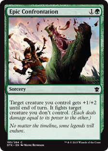
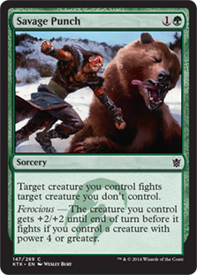
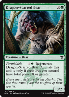
K: Savage Punch was one of the most fun cards in Khans, simply of basis of concept and art alone. You can tell they knew they had something good on their hands, because it was one of the cards they previewed the set with. There’s a reason many people at my prerelease signed up for “Clan Bearpunch”. Epic Confrontation is a worthy successor, and probably the best artistic parallel between the two sets.
T: It’s too bad that “Clan Dragon Punch” is already taken by Ken and Ryu from Street Fighter. As fun as Savage Punch is, I’m glad they’re not punching bears anymore on the new Tarkir. Since they’re now an endangered species, delivering a tooth-loosening uppercut to one of them would be rude at best.
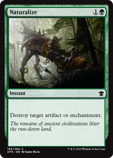
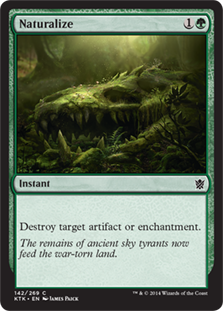
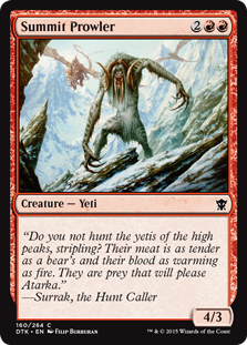
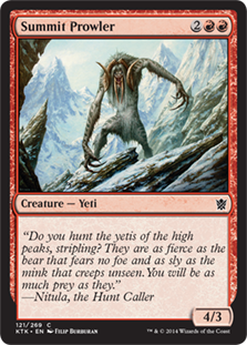
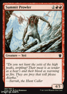
K: This is how you do a reprint! In fact, the new printing of Naturalize actually justifies my minor complaints about the old one (i.e., a dragon skull as an ‘artifact’ being a bit of a stretch). So how is this different from, for example, Summit Prowler? I think the biggest advantage Naturalize has is that the original printing actually communicated something about the world in the first place, which makes the contrast between how things are now more meaningful. Summit Prowler was kind of a nothing card in the first place and said little besides “Hey, there are yetis.” Another protip: If you’re looking to show how different things are now, it’s probably best to use two different arts, instead of the same one twice.
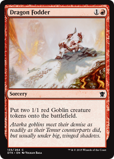
T: It’s a good thing they tied up that loose end. Now we all know what happened to the rocket launcher from Collateral Damage. I found it interesting that dragons apparently don’t decompose as quickly as goblins. So did all the paleontologists they’ve eaten.
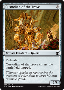
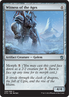
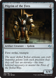
K: Exposition-Bot still expositionin’ no matter the timeline. I’m gonna go ahead and point out that the most skilled Jeskai artisans seem to have been utterly wrong about this golem being able to eventually master “the Fires of the Jeskai Way”. It’s had a thousand years to practice and certainly hasn’t gotten any better at karate.
T: It’s not like anybody would know. All it does is stand around guarding Silumgar’s money pile all day. Exposition-Bot needs to find a more rewarding job, where it can use its talents, and not just be some gilded trophy in an evil dragon’s treasury. Sure, that new solid-gold chassy looks cool, but is it worth the cost of your robot dreams? A successful mid-life career change can be tough, but I’ve heard of stranger things.
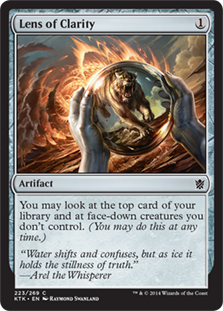
K: Finally, we get to learn the backstory of Lens of Clarity! Well, I guess sometimes you just need a little stability, a reminder that some things don’t change. When you’re unmoored in the unsteady seas of time, it’s a tremendous comfort to know that Lens of Clarity is still garbage.
T: Taigam is like the Goofus of Tarkir. If the most powerful magic you can find is a Lens of Clarity and Taigam’s Scheming, you’re planeswalking wrong.
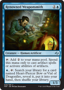
K: So how far ahead of his time is this weaponsmith if he’s creating technology that is still in regular use a thousand years in the future? An impressive dude to be sure.
T: Renowned Weaponsmith’s “putting things in containers” technology was truly ahead of its time.
Best of and Worst of
Flavor Text

K: Some of the cooler, more evocative flavor on a Silumgar card. I’m loving the combination of art and flavor text.
T: I guess it pleases Lord Silumgar to roll around in a pit full of corpses. Personally, if I had the power and resources of Lord Silumgar, I’d want a swimming pool full of Greek yogurt instead.
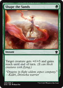
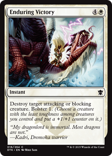
K: Dromoka appears to have a slight theme of being the most dragon-slayingest of the dragon clans. I appreciate the little extra bit of characterization that this gives them, since most clans don’t seem to have much, and most of them successfully hit the badass note they’re aiming for. Plus, Shape the Sands has great art! Enduring Victory is my vote for Best Flavor Text of the set.
T: If most dragons aren’t immortal, your dragonlord’s claim seems questionable at best. Then again, I’ve never tried to kill her. I thought it was really interesting that Dromoka exists in this unique space that feels simultaneously lawful good and draconic, until I realized that it’s called imperialism and it’s been around basically forever.
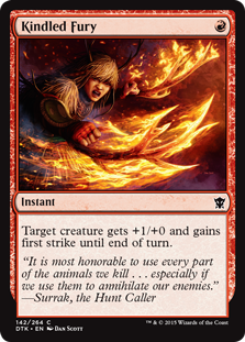 K: This would be kinda fun flavor text if they had left out the second part of the quote. My guess is it was originally written that way, but someone put a note on it that said, “Are people going to get this?” The audience probably would’ve gotten the joke without it, and it would play up the contrast between the extremely silly flaming antler image and the spiritual-ish tone of flavor text. Have a little more faith in your audience, Wizards. As a bunch of nerds, they’re better equipped than most to detect subtlety.
T: I think it would be funny if the card gave your creature +2/+0, because there are two antlers. And it should be called Horns Aplenty.
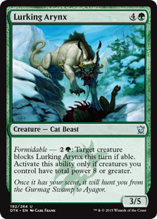
K: Dang! I thought I’d be safe in Ayagor! Oh well, I guess I’ll just have to go on to Griffindor or Narnia.
T: Tell me about it! Only an idiot would hide in the Dragon’s Bowl. You’re not in Karakyk Valley anymore, stupid! Hello! Anybody home? The real question is what an arynx is doing in the Gurmag Swamp in the first place. I mean, get a load of this schvantz. He must have taken a wrong turn on his way to Qal Sisma.

K: What does this flavor text mean, and what does it have to do with fighting a mirror version of yourself?
T: Maybe they already used “Wherever you go, there you are.”

K: Cause before he was reanimated, the giant swamp ogre had a really rich and meaningful life.
T: [Alternates between working, sleeping, and staring at a computer until he dies.]
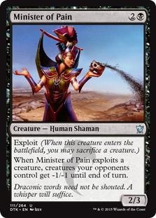
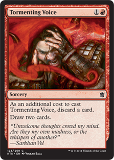
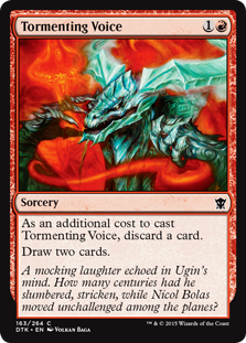
K: Even though another card narrowly beat it out in the race for the Grudgie, I want to mention “Translated from Draconic,” which appears on a number of cards, among the flavor text slops we’re currently handing out. Honestly, the idea that dragons have their own language and that it has special properties and cultural significance is not a bad idea, but you can do it on cards like Minister of Pain and communicate that a lot better. “Translated from Draconic” is clunky, unnecessary, and confusing. Worst of all, it sucks you out of the fantasy completely by bringing up all kinds of logistical questions about whether or not all these worlds that planeswalkers are always hopping around somehow share a language.
T: Also, Minister of Pain seems like a completely unnecessary position on the clan council. Is this person even an elected official? I find it hard to believe that anyone would vote for someone whose job is to come into their homes and body slam them at unexpected times. Although, I guess we do have the IRS…
K: To me this is the easy winner of the Ancient Grudge Commemorative Worst Flavor Text Award™. In fact, it shares a few things with that legendarily bad flavor text: Redundant and artless exposition, and reading like a first draft that the writer forgot to come back to. This clunker compounds these issues by also committing the frequent Magic sin of fantasy word salad. This goes hard on the exposition, but to anyone who isn’t already familiar with the 5 (!!) proper nouns mentioned in this flavor text, it’s confusing and meaningless. Small flavor bonus points go to this card as it is visibly exiling the Sultai artifact Altar of the Brood.
T: Grudgie for sure. They couldn’t have even saved this quotation by attributing it to a Tarkiri history textbook, because it explicitly mentions an alternate timeline. One of the first things you learn in any creative writing class is, “Show, don’t tell,” and this card flagrantly violates that maxim on several accounts. I’m amazed that something this clunky and convoluted made it into print. Then again, what do I know? These flavor reviews are probably terrible. [Editor’s note: DON”T FORGET TO INSERT PASSIVE-AGGRESSIVE NOTE HERE BEFORE FINISHING REVISIONS AN DPOSTING -- PlanetWalls]
Art
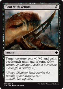
K: Hilariously gross! I love how the positioning of the right hand in this art could either be saying, “Thank you for this boon, Lord Silumgar,” or, “Ugh, geez, this is going to be hard to wash off.” Honestly, it’s probably a little bit of both.
T: Dragon venom has the consistency of cooling cheese. Can you imagine having your mouth full of that stuff all the time? Bleck. He looks like he just ate a fistful of Gushers.
K: And from the “we found this lying around in an unused art folder” collection…
T: “In new Tarkir, dragon eats bloodfly. In old Tarkir, bloodfly eats you!” — Yakov Dragonclaw
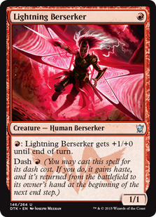
K: In a set where one out of 5 cards is covered with lightning, Lightning Berserker manages to stand out. The unusual color palette, the movement and energy of the card, and the cool geometric patterns going on make this one of the more striking illustrations in the set.
T: Lightning Berzerker’s energy is definitely striking. I sat bolt upright when I saw this card. Among so many static images, this is a perfect storm of art and design. Just in case my judgment is clouded, we should get someone else’s opinion. I elect Rick.
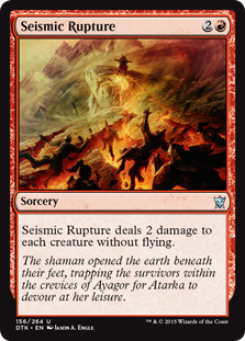
K: To me this art looks like the art for a card that keeps things from being able to block for a turn. I don’t know how to quantify this, but there’s something about it that feels that way. I might not be the only one; this is clearly a very good effect and I’ve seen it go very late in drafts.
T: The art clearly depicts people falling into open pits of lava, but the flavor text seems to say they were trapped alive in rocky crevices. I don’t know which it is, but that shaman needs to get his or her story straight before Judge Rick gets here.
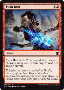
K: Due to an ancient translation error, modern Tarkirians think Dakla is “the way of the bow,” but actually it’s a curse that anyone on a card mentioning it will have a really weird-looking head.
T: Kolaghan archers also use their dragonlord’s lightning to string their bows, whittle their arrows, and tighten their braids. They’re really dependent on it, honestly. I’m going to go turn on the electric light in my kitchen, get a snack from my refrigerator, and research wilderness survival on my laptop so I don’t end up like them.
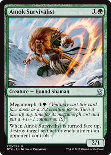
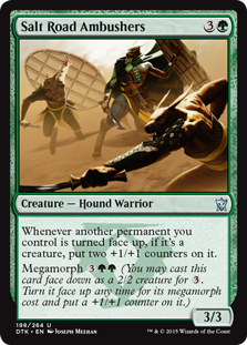
K: Was there no style guide for the dog people in this block? That’s the only way I can explain why you have cards that look like Ainok Survivalist and cards that look like Salt Road Ambushers appearing alongside one another. I know dogs can look dramatically different from each other in real life, but does that mean someone took the time to engineer various breeds of dog people in this world? Better to not even get into that line of thought. Either way, one of these looks cool and one of them looks really stupid. I’ll leave it up to the discerning reader to determine which is which.
T: There’s a pretty broad range of phenotypes among humans in Asia, so it’s at least plausible that there could be different races of Ainok on Tarkir. I’d extrapolate further, but then I’d literally be comparing non-white people to dogs, which seems problematic no matter how much pseudoscientific language I pile on top of it.
K: Oh cool, they printed a card based on that weird-looking guy from Die Antwoord.
T: Nice! Having already seen this and the aliens from District 9 (i.e., Homarids), I’m looking forward to a planeswalker modeled after Nelson Mandela in an upcoming set.

K: Once you see that this looks like a guy taking a group photo with a selfie-stick there’s no going back. I heard this was gonna be a modern staple until that was pointed out, and now everyone’s too embarrassed to play it. A cautionary tale about how art impacts playability.
T: If there’s one thing to watch out for in the new Tarkir, it’s getting photobombed by dragons.
K: Should’ve been a dinosaur. Also, should’ve looked less stupid than this. The fact that this guy is actually somewhat evocative of the namesake of the award might be coloring my judgment a little, but to me this is the winner of the Hunt the Weak Commemorative Worst Art Award™.
T: Seriously. Get your hands on as many alternate versions of this Huntie winner as you can, because those prices are going to go way up. They should never have errata’d dinosaurs to lizards, in my opinion. It’s not even accurate! Dinosaurs aren’t a subcategory of lizards. Are dragons lizards? Of course not! Just ask all the taxonomists they’ve eaten.
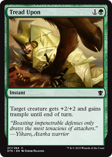
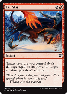
K: Is it always the case that it ends up looking really stupid when they try to do illustrations with a lot of movement? No, but there’s certainly a correlation. I think my favorite part of these cards is the motion blur! It’s like I’m in a bad 3D movie where things are coming right at me. I also dislike the flavor text on Tail Slash.
T: On top of all that, the guy being Tread Upon seems to be made out of glass and sand. “Impenetrable” and “easily crushed by normal non-magical pigs” must be homophones in draconic or something.
K: Let’s contrast! This is a delightfully silly and kinetic piece of artwork. The goblins in this block are a lot of fun and have had a bunch of great illustrations associated with them.
T: That goblin’s got The Crave for Honeycomb.
K: Here’s another example of the goblins being put to good comedic use. I think the horse head it what ultimately sells it for me.
T: Disagree. He didn’t even de-antler the elk head before presenting it to his dragonlord. If that were me, I would be very displeased and possibly even breathe fire on him.
K: Super cool art on this one. I don’t say this often, but I think it would look great in foil. Really enjoying the sense of scale and awe, although I’d appreciate it if the plumes of lava had subtle images swirling through them, to go with the “visions” part of the card’s concept.
T: This art is gorgeous. Unfortunately, it’s now canon for red mages to summon the elements via pelvic thrust.
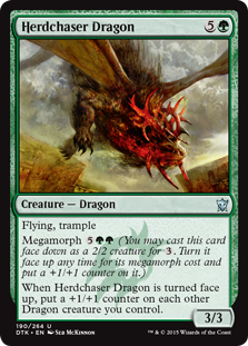
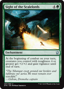
K: Some of these dragons look really good. I’m gonna take this space to say that I still really like what they did with the different broods and how they distinguished them from each other, at least from a flavor/art perspective. You might argue that they got a significant assist from the various D&D dragons, but I see pretty much no problem with that. Sight of the Scalelords and Herdchaser Dragon are my choices for Best Dragon Art of the set.
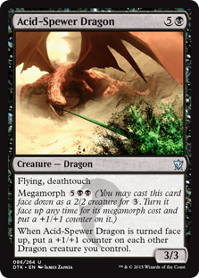
T: Herdcaser Dragon’s artwork makes a clever nod to the eponymous dragonfruit, because its head is shaped like one. My choice for Best Dragon Art is Acid-Spewer Dragon, who’s doing a really nice Jackson Pollock kind of thing:
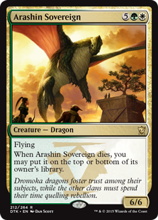
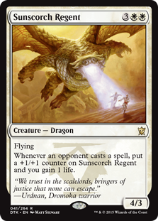
K: And the award for Worst Dragon Art goes to … actually it’s hard to choose just one. Between Arashin Sovereign’s humorously tiny head, and Sunscorch Regent looking like a rejected Internet meme. Either way, Dromoka’s gotta step up her dragon game if she wants to compete.
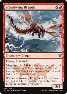
T: My pick for Worst Dragon Art is Stormwing Dragon, who might, for all we know, be really cool-looking. Why would anyone paint something from this angle? This dragon’s right thigh and tail are not its most interesting features.
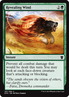
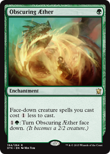
K: Normally it wouldn’t even be worth it to mention that the morphs still look stupid on cards like Revealing Wind; they’ve been looking stupid for literally more than a decade now. Except! Obscuring AEther comes in at the last possible minute and proves that actually you can make morph look cool. Ironically, this is a net negative impact on the art of the block, as now the other morph arts looking so dumb is less excusable.
T: Obscuring Æther does look cool. For the first time, I’m seriously considering becoming a megamorph. Actually, I’m glad morphs don’t exist in our home plane. I can’t imagine how stressed out I’d be if there were always a small chance that something innocuous like a pine cone could just turn into a vicious bear and kill me.
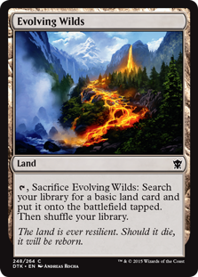
K: Of course the land has great art! The land always has great art. If there weren’t an unofficial rule against it, I think we’d probably name a land each time for best art. Evolving Wilds does deserve a special mention here, however, since this is by far the best it’s ever looked. It also manages to evoke the mechanics of the card really well. It’s a landscape that really does look like it’s in a state of flux that could eventually produce just about anything.
T: Sure, Evolving Wilds are beautiful to look at, but try having one in your back yard. You go to take a dip in the lake, and suddenly a torrent of lava is gushing out of the ground at you. I swear, if the market weren’t so bad, I’d sell. It’s all these damn dragons putting properties into foreclosure. They’re utter monsters! Tax Silumgar, I say.
K: And one more good one. The color palette here is really cool and the illustration does an excellent job of creating a mood of awe and mystery. It’s close, but not my vote for best art.
T: This one makes me nostalgic for all the old clans. Except the Sultai. Good riddance, you sadistic weirdos. I hope you’re being slowly digested by one of your own exotic pets somewhere.
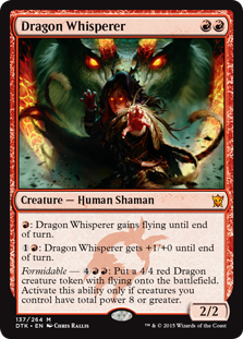
K: Dragon Whisperer is my vote for Best Art of the set. As a card it hits all the notes I’m looking for and is a superb representation of what the set is about at its best: It’s evocative of earlier cards in the block like Rattleclaw Mystic and Whisperer of the Wilds, highlighting the change the clans (and specifically the whisperers) have undergone in this new timeline. The framing and movement in the card are just really well executed. It’s got a badass giant dragon in it. What more could you ask for?
T: I’ll second that. Best Non-Land Art. Dragon Whisperer is over-the-top in all the right ways. I love her cool martial arts poses, and I really think the dragons do too. Anyone can learn to speak draconic. What truly makes a Dragon Whisperer great is showmanship.
Overall Design
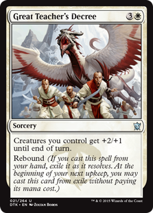
K: A real ‘great teacher’s decree’ would be “stay in school!” or “believe in yourself!”
T: I wish my high school teachers were dragons. Maybe math class wouldn’t have been so boring. I feel like there’s the seed for a Disney Channel sitcom in there somewhere.
K: “Kill! Kill them all!” -Great Teacher
Ojutai’s Wise Maxims, translated from Draconic

K: This card is pretty low-key for a dude who is literally surfing on a laser beam shot by a dragon. As far as card concepts go, it’s about as awesome as you can get. Mechanically? I mean, it does kinda do what the card says it does, but it lacks the “wow” factor that you’d imagine dragon laser surfing might have. File this away in the “idea more exciting than execution” folder, right next to Belligerent Hatchling (a.k.a. the dogs with bees in their mouth, so that when they bark they shoot bees).
T: To be honest, this seems incredibly impractical from a tactical perspective. What is the guy standing on the laser beam going to do that the laser beam wouldn’t have already done by itself? Maybe this is just something they pull out at U.S.O. shows, like those synchronized jet routines. Dro-mo-ka! We’re #1!
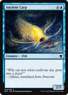
K: The only problem I’m having with this card is that it’s got such great art and flavor that I’m having trouble deciding which category to put it in. I love this big dumb fish, and how it illustrates that all you need for a flavor win is a good name and some cool art. I kinda wish there had been some kind of small carp somewhere in Fate Reforged for this to refer back to, but as a standalone card it’s still fantastic.
T: “Give a man a fish, and he’ll eat for a lifetime. Teach a man to fish, and I’ll eat for a day.” — Ojutai, on Fishing Licensure
K: Don’t you mean Ojutai, on Fishing Licensure, Translated from Draconic?
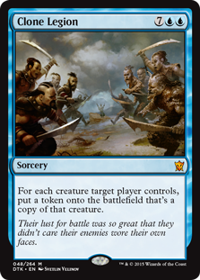
K: Just call this card Episode 2, cause it’s attack of the clones. I give this card the “most mythic-est mythic” of the set award. Everything about this, from the art, to the name, to the ridiculous effect says, “We turned Clone up to 11,” which is a fine way to make a good mythic. Another thing you could say when you cast this is, “Send in the clones.” With tips like these, you’re sure to be a hit at your next flavor draft.
T: Why can’t we see that war is really only hurting ourselves? Actually, I sound like I’m being sappy and ironic, but I guess I’m not. War is terrible. Nobody in their right mind would argue otherwise. Why are we still doing it when we all supposedly agree how awful it is? Look at the facile satire on this card, and tell me why we still can’t heed its painfully obvious subtext. Post your suggestions for how to achieve world peace in the comments!
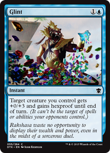
K: A lot to process on a card like this, but overall I think the art and concept is good-bad rather than bad-bad. It is hard to accept that they’re using a rare one-syllable name on a card like this, however, especially when “Make It Rain” would’ve been so much more evocative.
T: This is one of my favorite cards in the set. It’s got everything I look for in one streamlined package: Hundreds of tiny, colorful jewels? Check. Glint has it all!

K: This is my favorite flavor in the set. This does a really good job of the idea of animating a spell, and does it in a way that feels intuitive and minimally complicated. I don’t think I needed the scroll to have little legs, but even that’s pleasingly silly. Good job, Living Lore, you’re my vote for Best Overall!
T: I still think Glint deserves Best Overall, but this is a concept I’ve wanted to see for a long time, and it’s very well executed. A living scroll is way cooler than the Microsoft Paperclip Elemental I came up with.
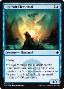
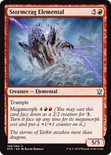
K: The embodiment of an updraft? The essence of a “stormcrag” (??). Clearly we are running out of things for elementals to be. People worry about the long-term health of the game in terms of big problems like power creep or complexity creep, but I’m pretty sure this is what’s gonna kill Magic. Stormcrag Elemental has some sweet art, however.
T: Stormcrag Elemental has a pretty nice “Night on Bald Mountain” thing happening, but what is Updraft Elemental? It looks like the logo for a line of organic poultry products. It looks like I’m about to watch a Columbia Tristar Home Video from some alternate universe ruled by chickens. This is not as majestic as I think they think it is.
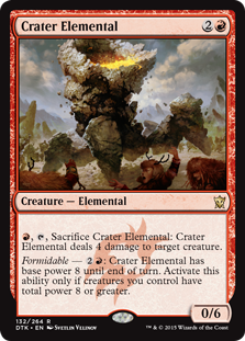
K: Never mind about what I just said about them running out of things to make elementals out of. This card shows that with the right art, even the most absurd concept can hit home.
T: In old Tarkir, meteor hits crater. In new Tarkir, crater hits you! If you look closely at the foreground, you can spont Cindy Lou Who fleeing in terror.
K: More mechanics for red! Yay red! I like the space this card is playing in and I love that red is becoming the color that can do anything, as long as they do so within the philosophy of recklessness that the color embodies. Contrast this with blue, which is the color that can do anything, as long as it’s within the color’s philosophy of being the best. They might be hitting the temporary card draw space a little too frequently lately, but I still prefer that to “wacky random enchantment number 32.”
T: I like my Wacky Random Enchantments, but it is nice to see red getting some more interesting effects at lower rarities. In fact, they’ve been branching out so much that Atarka’s witnesses are now going door-to-door, spreading the good word about fire. It’s a pretty easy sell, to be honest. If you don’t listen to their pitch, they just burn your house down.

K: We haven’t seen an effort to represent the horror trope of ‘stitching a bunch of corpses together’ this strong since Stitcher Geralf. The concept would’ve stood alone, but the mega creepy Nils Hamm art just takes it to the next level.
T: I love the art, but the name annoys me. I’d never heard of the term “weft” in a fantasy context before Lorwyn/Shadowmoor Block, and I’m pretty sure it was just made up by someone on the creative team. It made sense in the Welsh-Gaelic world of Lorwyn, but I wish they’d stop trying to make it a regular thing now.

K: So here’s something kinda cool: Back when Sultai was a thing, decadent nobles made zombies walk around with fruit bowls for heads. Now that Silumgar is in charge, those nobles are walking around with heads bowls on their heads. The parallels aren’t perfect, but I respect a clan who have taken “eat the rich” literally.
T: Yeah, Silumgar’s a real champion of the little guy. This seems like a horrific way to torture someone, by the way. I’m upset that it’s in my mind now. What would you do if your head were in that basket? I think I’d vomit all over myself so my head would taste gross and maybe the dragons wouldn’t want to eat it anymore. Post your solutions in the comments!
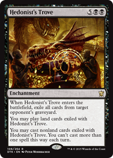
K: These two enchantments both feels like nice top-down designs that represent smaller internal stories in the clans they each represent. They’ve both got great names that go perfectly with their designs, and the art is on point as well. Both cards might also be receiving the hidden benefit of being too wordy for flavor text to come along and screw things up.
T: Silumgar’s trove is so vast that he must consume three plates full of treasure every day just to make room in the vault. It gives him agonizing indigestion, but Silumgar expects all within his kingdom to suffer for his opulence equally. You know the saying: No pain, no endless compulsion to acquire more belongings.
K: Kudos on whoever found the most perfect possible reprint for this set. If we had an award for that, this would win in a walk off, but we spent all our extra award budget on this Stupidest Looking Dragon trophy.
T: Readily? You can tell this card has great design because it manages to clearly convey its meaning despite clumsy flavor text and completely incomprehensible artwork. Which arms belong to which goblin? Are they in shadow or not? Is something on fire? It’s all just kind of a haze of maroon-and-white, as far as I can tell.
K: Last set we had butt fight; now we have butt war. I always appreciate it when they make weird cards like this, but I wonder how much appeal there is for the average player. I guess this card is a flavor helper. You don’t exactly understand why creatures are attacking with their toughness, but you get that defense is a theme in the Dromoka clan.
T: I imagine toughness battles as two things crashing into each other full-force. Every battle is determined purely by mass. Let’s just put helmets on, and run toward each other at top speed, you know? I’m extra happy to see this mechanic again because I was such a big fan of Doran, the Siege Tower. Does that make me crazy? Possibly.
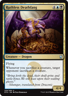
K: See? This is why I said last week that Silumgar is the most developed of the dragonlords. This card is oozing with flavor and manages to make a dragon draped in gold chains sitting on a pile of bones exactly as cool as it sounds for once. Additionally, this would make a great album cover for your slightly racist fantasy-themed nerd rap album.
T: It was only that one time. I’ve done a lot of growing up since then.

K: What went wrong here? If Foul Renewal is the card whose art came from a dusty unused illustration folder, this is a card whose design seems to be right around Mirage era. Why does it mill exactly 2 and not some more significant number? Why is the zombie making not tied somehow to creatures going into the graveyard, as many other cards with this mechanic have done? Why do you have to pay 2 mana for the privilege of putting these unrelated and cross-purposed abilities on the stack? Necromaster Dragon feels like someone put a card in the design file that said, “dragon that does something with zombies and milling,” and the printing company had to just wing it. For me it’s the Worst Design of the set.
T: The other Silumgar dragons have eyes, right? This one looks like it was designed by H.R. Giger.
[Out of nowhere, the door to Ugin’s haven flies open.]
Sorin Markov: Okay, we’re back.
T: Wow, okay, that was sudden.
Sorin: Nice work. You were both functional and adequate. I hope your fellow mortals receive a deep and transformative satisfaction from the somewhat light-hearted irreverence you have demonstrated here today. I certainly have. In fact, stay for dinner, and spend one more night on Tarkir.
T: Do we have to sleep in the barn again?
Sorin: Yes. With the livestock. Seclusion is only an option for the strong.
I have to comment on this just to let you know how brilliant these articles are. I really appreciate the effort you put into them and it’s nice to ignore the playability of a card for once and look at the art and/or flavour.
Thanks for taking the time for these reviews and please keep on doing them!
So glad these have a new home! I was sad when they stopped appearing on the store website. (However my draft picks improved in the interrim–flavor doesnt win FNMs apparently).
p.s. WHY IS DEATHMIST RAPTOR EVEN HERE?!