
These cards come from a time when everyone was so chilled out that they didn’t even worry about following a style guide, or having artists communicate with the creative department effectively. It was like the Wild West in the Frozen North. It should have been called Stone Age. In our first installment, we covered white, blue, and black, but did you think we were gonna stop there? Snow way, Jose.

Jesse T: You know you had a good Saturday night when you wake up on Sunday half-naked in the snow with a weird tattoo on your back.
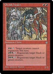
Jesse K: I just love the weird effect this card has and how top-down the design is. Your creature is such a pariah that no other ones are willing to be summoned. The real question is how this effect ended up in red of all places, and my honest guess is that it’s since the card is a ‘brand’, you would need something to be hot in order to do that.
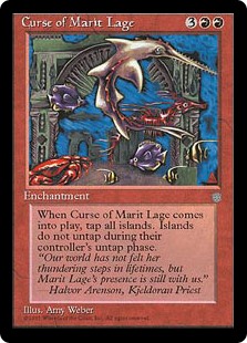
T: The curse must be somewhere behind that “relaxing aquarium” screensaver.
K: Love that goofy saw fish. This is definitely closer to a stained glass you could buy at an art festival in Key West than it is to a Magic card.
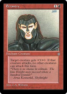
T: The artist really stuck to the directive of drawing a lone knight, and absolutely nothing else.
K: It looks like this guy caught on the fact that you could maximize your per-hour profit by doing as little work as possible. This has got to be some of the worst art of the set.

T: If you squint really hard, can you find the yeti in this card’s artwork? Hint: It’s about to suplex its unsuspecting target into submission. The flavor text seems to imply that the yeti is such a silent killer that it’s the last thing you smell before you die.
K: This card is just fantastic, on a flavor, art, and conceptual level. In fact, they found this idea to be compelling enough to revisit it in the bizarro time warp that is Coldsnap. To me the standout is the art, which features a really cool and infrequently seen perspective that only underscores the flavor of the card. An A+ for me.
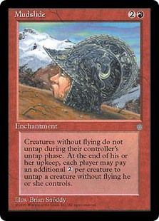
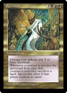
K: Grosssss! This art is hideously evocative, although it loses some points for inaccuracy, since I’m feeling like it would take a lot more than 2 colorless mana to come back from this situation.
T: Speaking of mud, the color pie was just a complete mess back then. If I just had seen the text box without the name or the mana cost, I would probably guess it was three other colors before red.
K: Hey, top-down design, dude. You know what a big draw it is to really get the feel right of my favorite evocative fantasy trope, summoning a mudslide?
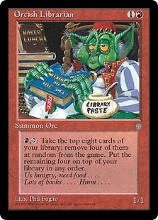
K: Style guide? What’s a style guide? Creature type consistency? Who cares? What the heck’s a ‘tone’?
T: I can believe that there are different races of orcs in different parts of the world. What I can’t believe is that William S. Burroughs had his work published on Dominaria.

K: “The card’s called Pyroclasm, we want you to draw whatever you want.” — Magic “Art Direction” circa 1994
T: While the giant scowling face of the devil is certainly interesting, the real attraction here is the worst Jaya Ballard flavor text ever recorded.
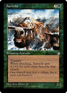
K: Aurochs have super great art and are a real Ice Age fan favorite, being memorable enough to inspire an entire theme in Coldsnap. I love the somewhat impressionistic art style they’re done in, you can just see the steam rising up off their backs. Communicates that this is “winter world” better than most cards in the set.
T: Give a man an aurochs, and you’ll feed him for a day. Teach him how to play Magic, and he’ll spend his money on that instead of food and starve to death.
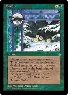
K: When I said before that I wished more card art was done in a more abstract style, this is the card I was thinking of. It tells you just enough between the art and the flavor text to give you the general idea of what’s going on, without being completely literal about it. I can imagine that if this were printed now it would feature a dumb-looking rhino man looking confused and lost in a forest.
T: That checkered border thing is neat, right? I agree completely with everything above. The flavor text is okay, too, but it gets better when you imagine it’s being mumbled through a mouthful of bioluminescent mushrooms.
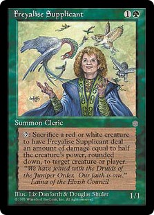
K: I’m seeing this picture, and I’m reading this card text, and I’m thinking to myself, “Is this grandma going to throw that little winged kitten at me?” This is just such an incredibly odd art choice, and does nothing to answer the questions a player might naturally have about what ‘Freyalise’, ‘The Juniper Order’, and ‘Laina’s Elvish Council’ all are.
T: I’d make fun of her hair, but it looks like it’s already been teased enough.
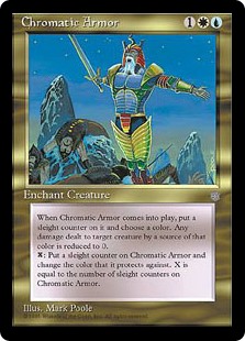
K: Geez, I guess all those corpses strewn about were on the “Very Naughty” list this year. As for what this card does, I have no idea, and don’t intend to read it.
T: Whatever it is, it involves sleigh counters. How many more have to die before they end this senseless war on Christmas?
K: Richard Kane-Ferguson is one of an increasingly rare breed of Magic artists who have unmistakable personal styles. He was still doing cards as recently as Lorwyn Block, but since then he’s faded away. Go check out his list of credits on Gatherer, and you’ll quickly recognize a lot of them. I feel like it’s a little sad sometimes that cards in the newer sets look pretty same-y in general, but I guess that means we also don’t get as many Orcish Librarians.
T: Richard Kane-Ferguson’s work is immediately recognizable. No matter how closely you look at it, you can never tell what it actually is. I think I see a person in white with one hand, but it might be someone else’s hand, or maybe a tree branch. As much as it sounds like I’m complaining, the whole thing is strangely beautiful, and I’d love to see him back on the artists’ roster too.

K: And here we appear to have walked into the cantina from Star Wars. I can only assume that they interpreted elemental as “pertaining to a weird monster” rather than “pertaining to the elements”. So I guess we’re reading the future through that creature’s warts and wrinkles. Either that or no one involved in the production of this art knew what the name or concept of this card was at all.
T: I guess inexplicable rhino people aren’t strictly a problem with contemporary sets after all. I think a randomly-selected name, casting cost, illustration, and text box would probably result in a far more cohesive design than this. The best part about it is the flavor text, which makes me think for just a second that maybe it only seems so disjointed because I’m looking at it wrong.
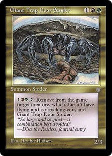
K: Another great example of top down design in Ice Age. My favorite thing about this card is that the spider just leaves after he’s got his meal. He wasn’t actually all that interested in fighting for you, he was just hungry.
T: “By that same token, also, stay away from trees, buildings, and clouds.” — Disa the Restless
K: Disa the Agoraphobe
K: Winning a game based on a coin flip? I didn’t know Modern was invented back in Ice Age.
T: That’s a great color to tile your shower because it won’t show dirt or grime too easily.
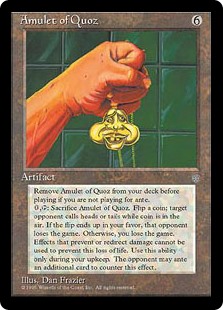
K: If I wanted to make it completely clear to a non-Magic player that I was playing a really stupid game, this is the card I’d show them. The effect and art both communicate clearly ‘yeah, let’s do something else.’
T: That’s right, we all play a game featuring a character that looks like the bastard spawn of Grimace and Alfred E. Neuman. Will we see Quoz the planeswalker someday? You technically can’t prove we won’t!
K: I keep coming back to this card thinking about what madman would actually put this in their deck. Imagine if you’re a kid playing this game casually in 1994 and your opponent plays this. They must be a psychopath, right? I would pick up my cards and leave.
T: But if you did, you’d forfeit your ante.
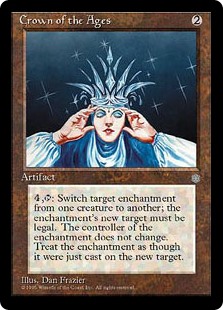
K: The first magical power of the crown is the ability to fit on a head much smaller than it. The second magical power is something you’re never going to use about enchantments.
T: Mirror, mirror, on the wall, background there, or not at all? I guess Snow White is on-theme for this set, at least. It makes more sense than lemurs.
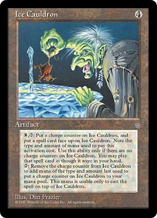
K: This card is well-known for being extremely difficult to understand, but I kinda get it. It’s a card that lets you store mana so that you can cast super expensive spells or, ideally, X spells. That doesn’t mean it was a good idea to print or anything, but it’s not completely unintuitive. What’s really impossible to understand is why this is represented as a cauldron made of ice, or what a witch straight out of a Halloween party city is doing interacting with it.
T: Readers, feast your eyes on the wordiest Magic card ever printed. Rivaled only by the erratad versions of Animate Dead spells, Ice Cauldron is induces headaches through not only its convoluted wording, but through the inscrutable tininess of the text itself. It’s a real shame I already exhausted my quota of Snow White references for this set review because whoa:
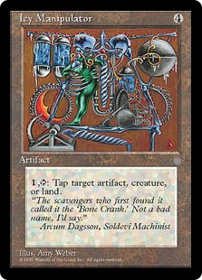
K: Bone crank? Is that really a good name, Arcum? What about the way this thing looks makes you think that? Ya know, I should probably be making fun of this art, but I find it weirdly appealing for some reason. I don’t know how the disparate parts wind up with tapping something (Where does the lizard with exposed ribs come in?), but there’s some kind of unimaginable, nightmarish Rube Goldberg vibe going on.
T: You know what else I like to call my bone crank? Go ahead, guess. I’ll wait.
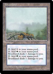
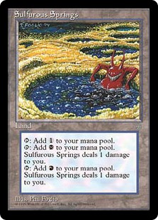
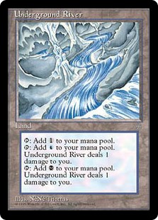
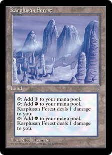
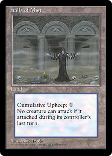
K: So I guess the pumpkins tap for green mana and the mist taps for white? To be honest, this whole cycle of duals is worth looking at because they’re so weirdly different from each other. I mean, check out that demon in a hot-tub. This is not an Un-set, yet there it is. Nowadays they mostly get the same person to do the whole land cycle. You could see these as a strong argument for why that’s a good idea.
T: These are laughably inconsistent. Underground River literally looks like it was drawn with no more than two colored pencils, and the snow-covered trees on Karplusan Forest just look like a bunch of “icy manipulators” sticking out of the ground.
K: Hey, remember when lands used to sometimes not tap for mana? And remember when sometimes they actually cost you mana? And remember when the art for these cards was some kind of grim reaper Monty Hall Let’s Make a Deal scenario? As nostalgic as I am for Ice Age, I think the game has come a long way overall.
T: Wow. The top third of the panel looks like a complete afterthought, the skulls on the ground have black dots for eyes, and those three hallways aren’t even bothering to pretend they’re symmetrical. I’ve wanted to call every other card on this list the ugliest thing I’ve ever seen, and this is no exception.
K: You know, Jesse T, that was a fun exercise and gave me a lot of respect for modern set design. Next you hear from us is probably going to be when we get mega-hyped for Battle for Zendikar. Except for allies, which nobody cares about.
T: You should never have too high of expectations for allies. The first thing I’m gonna do when we get to Zendikar is change out of these freezing boots, take a nice long soak in the tropical shallows, and get devoured alive by piranhas. I’ll see you there!
Really enjoyed this. Hope to see more on other sets from this era. Can’t believe you skipped Jester’s Cap though, one of the more iconic cards of the era.
Y’know, these cards seem to be more MtG than the newer ones. The new ones could have been taken from LoL, Diablo etc, or at least quite interchangeable (for me at least).

These goofy old arts really speak to me, maybe because I played them
Underground River was drawn more in the vein of Underground Sea hence the pale art. The Foglios always drew caricature-like arts.
I guess back in ’94-’95 there were not (strict) conventions about fantasy in general anything was passable as anything else