
Jesse K: Modern Masters is like a core set, except it’s only got cards people want! Well, mostly cards people want. At least a few cards that people want. . . Anyway, Modern Masters means reprints, which makes this a perfect opportunity to look back on some of the greatest art hits and misses from the cards reprinted in this set.
Jesse T Get ready for a fun-fueled romp through Magic‘s past, sort of like Hot Tub Time Machine! Unfortunately there won’t be any real story or likeable protagonists to be found, sort of like Hot Tub Time Machine. As your tour guides, we’ll use our “flavor expertise” to shed some light on the various planes we’ve visited in recent years. It’s a shame they didn’t reprint Goblin Guide because I’ve been all over these worlds. I even remember some of those places!
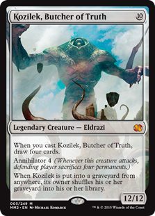
K: While there are many things I don’t love about the Eldrazi, I do think their art and concept have been knocked clean out of the park. I’m glad our next stop is Zendikar (Origins? What Origins?) because Lovecraftian horrors are one area that has not been overdone yet in Magic. Kozliek is probably my favorite Eldrazi, at least art-wise (everything elsewise too, actually). I love the contrast with the bright blue sky, and the sense of scale given to him by the foreground birds. He’s also super menacing looking with those creepy tendrils coming up in the front, and if you ever get a chance to look at the full art you can see that parts of his body appear to be made from giant humanoid shapes. Spooky!
T: Kozilek is back, along with Ulamog, Baker of Justice, and Emrakul, Candlestick-Maker of the American Way! Last we saw the Eldrazi, they were freed from their ancient prison on Zendikar. Instead of going home, they decided to stick around and deplete the land of all its resources, just like our founding fathers. I’m looking forward to revisiting Zendikar too, but I’m mostly just hoping to find some more Priceless Treasures.

K: Good news! Theros Block finally has a playable enchant creature! Bad news. It wasn’t actually printed in Theros. While I like referencing the newer blocks along with the older, the fact is that this card had great art before. I doesn’t help that this scarf-centric piece is reminding me about the needless cat people in Theros that annoyed me throughout the whole block.
T: I’m not looking forward to a new generation of Magic geeks growing up believing a coronet is a type of keffiyeh. Speaking of which, someone tell Brimaz that 2008 called, and they want their accessories back.
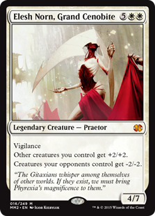
K: If the Eldrazi are Lovecraft, the Phyrexians are H.R. Giger. Elesh Norn has really jaw-dropping art that walks the strange line between beautiful and hideous. This picture does a terrific job of setting a mood, and is the best representation of why Phyrexia can be such a compelling villain. The otherworldliness and inhumanity captured here are way more interesting than the dozens of Magic arts that attempt to move by gory or frightening imagery.
T: Various definitions of gory and/or frightening may or may not include living things that look like flayed corpses. All of those Phyrexians with their weird, horrifying pain religion are going to feel so silly when they realize there was a typo in their holy scriptures. We’re all supposed to lead a life without sin, not skin.
K: Oh, hey there, dude on a cliff, whatcha doin? Nothin’, just hanging out with my glowing spear of light, goin’ on a vision quest to space with the help of a giant turtle demon breathing ghost breath on me. Probably gonna come back with a +1/+1 counter. Ya know, just generally Kamigawa-in’ it up.
T: Man, I miss college. Remember to stay hydrated, and don’t just do everything the turtle tells you to do! It’s not your boss. You can think for yourself.
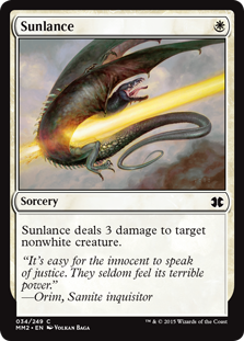
K: Ouch, I’m used to drakes getting owned, but right in the dick like that? I appreciate the directness, and how well this represents the infrequently seen, but often implied, sex-negativity of the color.
T: Actually, this is/was a female drake. You can tell, because she lacks the distinctive crest of her male counterpart. She was in heat, and Orim saw fit to execute her according to strict, puritanical laws apparently governing the behavior of non-sapient animals.

K: Who is Cloud Elemental? He’s been there for you through decades of service as limited filler. Cloud Elemental is a decider. Cloud Elemental stands strong on the issues. He’s an elemental we can trust, an elemental we can rely on. This message paid for by Cloud Elemental for President.
T: I don’t follow “politics” much, but those patriotic-looking birds seem to like him, and that’s good enough for me. My grandmother came to Calla Dale without a penny to her name, and she always told me, “When in doubt, base your decisions on the semi-random flight patterns of birds.”
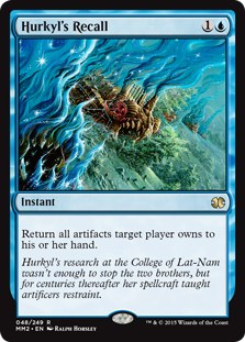
K: To me this card seemed to be a great opportunity for some new art. I mean, it hasn’t been printed since 10th Edition, and I hardly think this is the definitive visual take on this effect. Look at what’s going on here and tell me that you don’t think this could be done better. I can only assume that there’s some kind of problem with the steering column or the airbags on these gargantuan, landscape-destroying juggernauts that’s necessitating a recall of this volume. Another scandal for Toyota.
T: This artwork is terrible, and there’s no reason for a Magic card to look like this in 2015. Those blue wisps look like they were drawn by a completely different person than the rest of the painting. Why they’re so close in color to the background is beyond me. To top it off, the card references a character who isn’t even depicted in the scene! The only thing I’m enjoying about Hurkyl’s Recall right now is trying to say it 10 times fast.
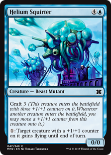
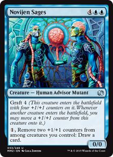
K: Between these two cards, it’s hard to choose which one really brings home the “Simic stuff really looks stupid sometimes” point that I’m going for, so I just chose both. Helium Squirter, in addition to the dubious honor of being the only Magic card with “squirter” in the name, features a tiny little dude in the bottom right, basically hype-manning for big HS. “Check out this squirter,” his gesture seems to say. Meanwhile, Novinjen Sages look like they’ve just walked off the set of some kind of futuristic space medical soap opera.
T: A Novijen Sage walks into a bar. The bartender says, “What’s on your mind?” “Cytoplasm,” replies the sage. “Cytoplasm?” says the astonished bartender, “I barely know ‘em!”
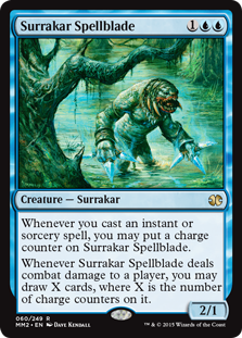
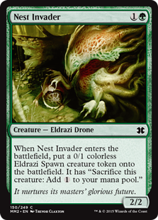
K: Nothing says “What?” like creature type — Surrakar. Well, maybe nothing except their choice to reprint this card over any of the dozen Modern or casual staples that players would’ve been actually excited to see in their $10 booster packs. Financial issues aside, this card looks like someone drew a Predator fan art but forgot to make it scary. In what is soon to become a theme of this art review, here’s another one that looks like it could’ve really used a fresh look, since this art doesn’t really convey anything to me except confusion. Cards like Thieving Magpie, Shadowmage Infiltrator, and Scroll Thief have suggested that drawing a card on damage is implies theft of knowledge. Are we to believe that that’s what this guy is doing here? Or is he maybe subscribing to the Hystrodon school of drawing a card “just cuz”?
T: You just said a mouthful, and you haven’t even addressed those weird crystal things in his hands, or how similar these look to M14‘s slivers. In fact, between Surrakar Spellblade and Nest Invader, a lot of Zendikar‘s original creature designs kind of look like slivers.
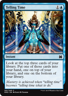
K: This card achieves the rare flavor-trifecta of good name, good art, good flavor text. I love it when they get a little bit more abstract with card art, and to me the time theme going on here is much more compelling than the traditional “wizard squints at glowing objects” visualizations. A for the additional effort and thought that went into this.
T: I’ve always liked this artwork too. The colors, balance, and detailed imagery are all very aesthetically pleasing. You really can’t hope for better from the umptieth card that lets you fiddle with the top of your library.
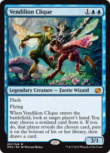
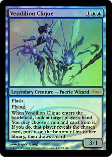
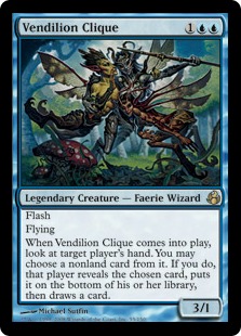
T: Which art looks cooler? Correct. The one on the right is objectively superior. Surprisingly few cards got new artwork in this edition of Modern Masters, and this chase mythic actually got downgraded from the sweet promo art it had 4 years ago. On top of that, this card has never felt legendary to me. If it represents three different characters, it should have three different modes or effects or something. As-is, this card is a flavor dud, and any copies you find should be sent directly to me for immediate disposal.
K: Jesse is indeed right, this new art is not great. Not only is it a downgrade, but it hews weirdly closely to the original art, right down to the background details and the poses of the fairies. It’s like someone looked at the old clique and said “This would be perfect if only the saturation were turned way up.” This trio, despite its constructed power, has indeed also always fallen flat for me, flavorwise. Since these fairies have literally no characterization that I can figure out, it seems like the only reason for them to be legendary is power level, which is not really what you want from your legends.
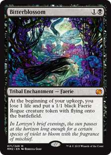
K: Rebecca Guay really illustrates Magic cards like no one else, and this iconic image is a great example of her talent. If I had to put it into words what makes her so unique as a fantasy illustrator, I’d say that she’s not afraid to make her images “beautiful”. I like the use of color and framing here especially.
T: I love the story this card tells, and not only the art, but the flavor text even manages to enrich it. Bitterblossom seems lovely at first, but it has a tendency to attract uninvited guests. It’s sort of like the time I found that free couch on the street. Speaking of which, if you ever find yourself with an infestation, lavender oil kills both faeries and bedbugs on contact.
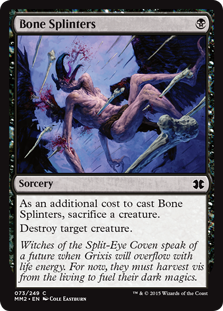
K: And here, by contrast, is an image that is only unpleasant to look at. Magic has a tendency to occasionally visit locales that the style guide must describe as “gross”, and Grixis (along with anything Rakdos-related) stands out as one of the least aestheticly-pleasing settings in Magic history. Blood-coughing emaciated naked vulture-man being punctured with sharpened femurs is not an image I’m not sure anyone needed to see. I guess they couldn’t reprint the much superior Avacyn Restored art because we’re not including Innistrad in Modern Masters yet?
T: The Rakdos may have the aesthetic value of the Insane Clown Posse, but this card is downright revolting. Why is its neck bending that way? The vomiting of blood and rending of flesh are definitely at least a little gratuitous. Even the flavor text is distressing me. All I had to read was “Split-Eye Coven”, and now I have the opening scene from Un Chien Andalou playing in my head. Grixis sucks. I dislike it. The weather is made of bones. I would not recommend it to a friend.
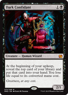
K: Greatness, at any c*DJUUuuuuub WUBWUBWUBWUBWUB dittitiditida SKCHRIIIIIIR*
T: I’d be willing to pay 2 life points to learn how Skrillex gets that nice, growly low-end sound.
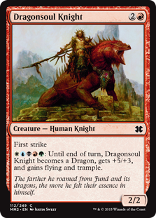
T: The dragons were in you all along, Dragonsoul Knight! They laid eggs in your trachea while you were sleeping! I like that this card tells a story, and I like that the story involves riding around on a giant lizard.
K: My only flavor complaint is that this super badass giant lizard doesn’t seem to add much as far as power and toughness to the basic 2/2 knight here. I just don’t get how this guy and White Knight just trade in a fair fight. You’d think a lizard mount would be good for an extra point of toughness at least.
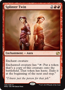
K: Cool art on a cool card. Giving red the whole “make a temporary token to attack with” mechanic has really given the color some much needed depth and trickiness.
T: Can it please be a running joke that every time this effect is printed, we just copy and paste the exact same comments about it?
K: Sure, I don’t know how many more times they’re going to reprint this card, since it’s a red rare that people actually want, and that seems like the thing they’re least likely to include in any given set.
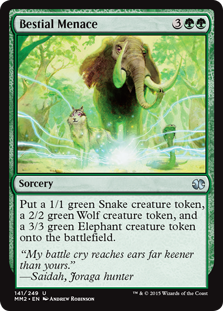
T: You’ve gotta love a card that does exactly what it looks like it does. You get these three specific animals, no more, no less. I like the artwork, and I think it has a lot of character. Attaboy, Wolf creature token.
K: I like this art too, but in a goofy way. It’s like if a bunch of jungle animals decided to form a super team. I imagine the wolf is the brains of the operation, the elephant the brute force, and the snake is responsible for reconnaissance and heavy explosives.
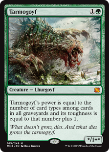
K: The new artwork for Tarmogoyf (which first appeared in the last Modern Masters) says “Oops, we didn’t realize this was going to be the best creature in Modern, we’d better make it look cooler.” Based on the size cues in the artwork, it seems to have grown dramatically as well in the intervening years, although I guess that is on-flavor for the big guy.
T: You can only do so much when the concept is literally just a big pile of garbage. With a keen eye, you can see Tarmogoyf slowly transforming into Fruitcake Elemental over time.
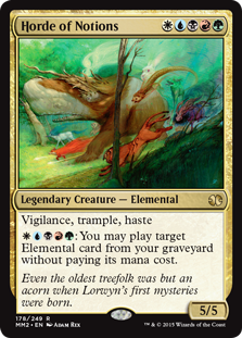
K: At its best, the artwork of Modern Masters gets to be a kind of greatest hits of art direction from all over Magic’s history. For me, it’s kind cool that this set gets to highlight the spirits of Kamigawa, the elementals of Lorwyn, and the Eldrazi of Zendikar, as those are some of the most ambitious and interesting creature designs that they’ve done. I guess what to me is most disappointing is that they didn’t take this opportunity to do any cool new artwork of these things. Regardless, Whale-Bear & Co. here is one of my favorite-looking creatures of all time.
T: Horde of Notions is some of my favorite artwork too. All of the creatures are so imaginative! There’s a frog in the background with long spindly legs, there’s a giant white rabbit floating in the sky, and I’m pretty sure there’s a caterpillar ripping a bong somewhere in the woods.

K: On the one hand, I’m glad to see Fred Durst finally get pilloried, but this is a little late to be culturally relevant, and I’m having a hard time seeing what this has to do with Magic. Also frustrating that this was one of the like, five cards in the set that they decided to get new artwork for, and this is what they went with.
T: It really is a baffling decision, but the new art and flavor text are great. You know, I ought to put this up in my office, because this is what I feel like when I haven’t had my coffee in the morning! Which is worse, indeed…

K: LMAO at the expression on this frog’s face. It’s like he’s saying to the viewer, “Yeah, I don’t know what the deal is either.” Was this Greg Staples’ silent protest at being asked to draw something called “Plaxcaster Frogling”? Or maybe the ennui on the frog’s face says he’s not even sure if he wants to bother to pay the 2 mana to gain shroud to avoid the bolt of magic about explode his face. Like maybe he’s thinking, “Is it even worth it? I think I’m ready to go.” I remember reading that the Simic (the Ravnica guild responsible for frogling it up) had a flavor of being not just mad scientists, but mad capitalist scientists, who patented all their creatures and gave them catchy names. You gotta wonder who Plaxcaster Frogling is for.
T: It’s for me! Sorry, everyone. Plaxcaster Frogling is one of all-time favorites. I learned all about Magic Online’s auto-yes/auto-yield feature thanks to the graft ability, and I’ve still got a soft spot in my heart for this indifferent-looking amphibian. (Or possibly from all the genetically modified & patented organisms I’ve eaten over the years. I’m still not sure. If you’re a doctor, tell us what you think in the comments!) Not only is it a 3/3 for 3 mana that makes all of your future creatures essentially unkillable, but it also bears a striking resemblance to classic Hollywood icon Peter Lorre:

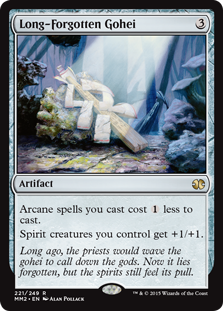
K: I guess the artwork is nice here, but to me this is a card that should’ve stayed forgotten. You could say that I wish someone looked at the design file and said “This one can Go-hei.” I mean, this card has produced no interest, either casual or competitive, for such a long time, you think they would’ve chosen a card that would raise the spirits of the player base a little more. It was an arcane choice at best, and spells disaster for the value level of the set. But seriously, why is this card in here and Gauntlet of Power isn’t?
T: From what I’ve read about the design of Kamigawa Block, the spirit/arcane mechanic was extremely parasitic, and generally considered to be a mistake. Why it’s a prominent theme of yet another set, I have no idea. If cards are going to be this insular and myopic, they ought to be flavor home runs. Despite looking like a baseball bat, this thing isn’t even close.
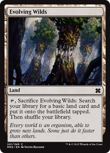
K: We need a five-color land for Modern Masters, the set that sells for 10 dollars a pack. Let’s go with the one that appeared in literally the last set. Certainly there are no better choices to fill this spot.
T: We’ve seen Evolving Wilds everywhere, from Innistrad to Tarkir, and all of them have looked better than this. Why are they using this artwork again? Could the wilds actually be devolving? A terrifying thought. Take care of the fabric of your multiverse, folks. It’s the only one you’ve got.
K: Well, that’s all we have time for today, as Jesse and I have to go put in some extra hours in the flavor mines in order to afford to draft this set. See you next time, when we inexplicably make fun of the art of Ice Age.
You can find Jesses K. & T. on
Facebook at facebook.com/twojesses
and on Twitter @twojesses.
The Vendilion Clique is indeed three specific characters: Veesa, Endry and Iliona (“Vendilion” is simply a portmanteau of their names, not some obscure adjective that WotC pulled out of their bottomless thesaurus). I agree that this doesn’t come out enough in the card but I’m not sure the solution would be to make a modal effect; in the story they often operate as a single unit and it feels too formulaic to me to have “this card is three characters therefore it has one effect for each character” all the time.
Bravo… I’ll now be more careful when targeting Peter Lorre.