
Good flavor is rarer and more valuable than an expedition. Just kidding, nothing is rarer than an expedition! But that doesn’t mean we can’t award some participation trophies like the millennials we are.
Jesse T: Hello, and welcome to our highly anticipated award ceremony for Oath of the Gatewatch! As always, we’ll be saying “farewell” to the current set by recognizing the best and worst of the bunch with superlative awards in art, flavor text, and design. If we’re lucky, there might even be a special appearance by Leonardo DiCaprio, reminding us of the disastrous impact the Eldrazi are having on Zendikar’s environment.
Jesse K: Alright Jesse T, I’m ready to go. Let’s hastily wrap up our coverage of the flavor of Battle for Zendikar Block (much like Wizards hastily wrapped up the story of Battle for Zendikar Block).
Achievements in Art
Coolest Eldrazi
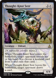
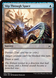
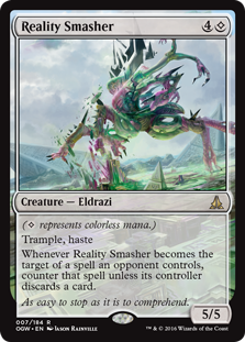
K: Let’s just ignore that Thought-Knot Seer is running roughshod over every constructed format at the moment and talk about how cool it looks. Is there anything creepier than a giant eyeball? I posit that no, there isn’t, and Dungeons and Dragons would agree with me. I like the design of Kozilek’s brood overall, they’re creepier, weirder, and thankfully more colorful than the Ulamog-spawn. I also like all the distortions of the environment that happen around them, best seen on Slip Through Space. Actually just the fact that they make the different strains of Eldrazi resemble their progenitors with visual cues (floating head parts, split arms) shows a level of attention to detail that I really appreciate. The Eldrazi’s appearance overall gets a rating of ‘good job!’ from me.
T: We all know it’s impossible to truly “paint” the Eldrazi. Kozilek’s brood in particular are constantly shifting and morphing in incomprehensible ways as they drift orthogonally across the 3-dimensional vector space visible to most non-wizard humans. At least that’s what I assume all that nonsense with the exile zone is supposed to represent. Slip Through Space does an excellent job of depicting that elusive moment when an Eldrazi passes through a localized black hole, and, for an instant, it’s both behind you and in front of you at the same time. For all I and most Magic players know, this is how quantum entanglement actually works. Way to know your audience, Wizards!
Least Coolest Eldrazi
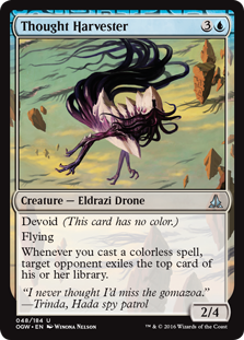
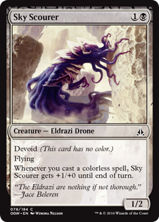
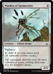
K: They can’t all be winners, as proved by the flying spaghetti messes on display here. Thought Harvester is probably my least favorite of the bunch; there’s no texture, there’s no shadow, there’s no menace. It looks positively goofy. Trinda is right, it makes me miss Gomazoa (a clearly superior sky-jellyfish). Sky Scourer is almost as bad conceptually as it is visually, with it’s tiny t-rex arms and octopus face. The art and flavor text imply that this is a monster that eats clouds (?), which, honestly, does anyone care? Least threatening Eldrazi since that one that was just an ant. Warden of Geometries winds up in this category despite his very cool name by virtue of his head appendages strongly evoking a triple exclamation mark, like you just caught him by surprise or he’s very stoked to see you.
T: The Warden of Geometries at my old high school was always really stoked to see me, but was never very vigilant. The Keeper of the Algebra Department was more of the disciplinarian. Neither of them had a giant cluster of berries for a head. To be honest, between the berries and the buckwheat soba noodles, I’m starting to understand why Ulamog is so ceaselessly hungry.
Achievement in Storytelling Through Art
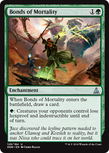
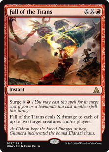
K: I don’t pretend to understand how it’s possible that this bunch of losers unceremoniously took out two Eldrazi titans at once, but it’s the focus of this set’s story, so we gotta just go with it. That being said, I think this diptych captures the moment well. I like it when significant story moments show up on cards, it gives the average player a window into the flavor of the set without requiring them to go and read back issues of Uncharted RealmsMagic story.
T: The only thing that would have made these cards better would have been if they were actually good answers to either of the two legendary Eldrazi in this block. Bonds of Mortality takes away indestructible from Ulamog, and then what? Fall of the Titans for 25 mana? You might as well just kill the other player at that point. Burn the face, Chandra! The face!
Best Land Art
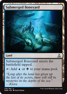
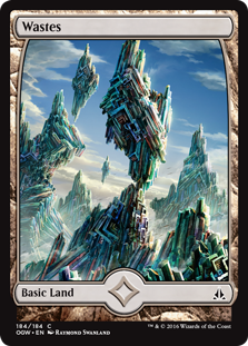
K: The lands have remained my favorite thing about returning to Zendikar, so it’s nice to see that there’s no shortage of options in this category. Submerged Boneyard gets my pick because, unlike many other lands in the set, it doesn’t overly rely on the presence of <>hedrons<> to liven things up (oh, they’re still there, don’t worry). Great name, great concept, great use of whales. Full art Wastes (the superior Kozilek version, obviously), gets runner-up recognition for wow factor and being used to successfully communicate a story element (the different types of distortion caused by the two titans) very elegantly. Here’s to hoping Wastes aren’t just a flash in the pan and a future set finds a way to bring back the wingdings in a novel, interesting way.
Best Visual Motif

T: While we have Wastes on stage, I’d also like to give a shout out to bismuth. Since the release of Oath, this unique-looking post-transition metal has been steadily climbing to the top of my list of shiny things to stare at. The first time I saw Wastes, I thought it was so cool looking it blew my mind. When I found out it was a real thing … I blew all my savings on bismuth crystals so I could build a life-size replica of Wastes behind my house. I’d take a picture of it, but I couldn’t afford to pay my phone bill last month. If anyone wants to help me out, please make all donations in the form of pure bismuth.
Best Nonland Art
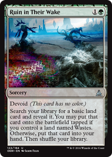

K: Although I criticized it on Chandra’s art, I do love the way the bismuth trail of devastation looks, especially in the extremely stylistic Ruin in Their Wake. Is the name and concept a major clash with what the card does? Oh yeah, big time. That doesn’t stop it from delivering as a piece of Magic artwork with great mood and tone. I also like Tears of Valakut, for similar reasons— check out those ominous clouds! Maybe this violates our no-picking-land rule, since both of these pretty much depict a landscape. If loving a sweet Valakut eruption is wrong, I don’t want to be right.
T: I see one sorcery, one instant, two radical rocks, and zero problems.
Best Impersonation of a Scrab
T: Not to be confused with Seizan, Perverter of Truth. Where Sky Scourer failed to make the consumption of clouds seem compelling, bizzy-bone succeeds yet again. Is that not gorgeous?
The Hunt The Weak Commemorative Worst Art Award
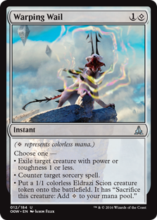
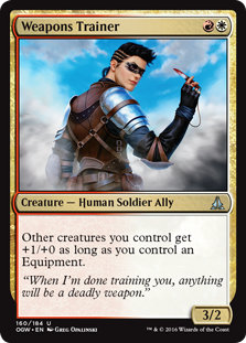
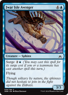

K: Where to begin? While overall the trend of very good visuals continues, there’s a regular rogue’s gallery of art issues on display in this set. We’re visited by all our old friends: Indistinguishable from Another Card (Jwar Isle Avenger vs. Guardian of Tazeem); Overuse of Digital Effects (Consuming Sinkhole from repeat offender Igor Kieryluk); Inexplicable Lack of Background (Weapons Trainer); even good old Stupid Looking Creature (Warping Wail) makes an appearance. Honestly all we’re missing is Clearly Repurposed Art and Literally a Mistake to round out the set. I think of these Warping Wail is probably my least favorite. That thing looks like something out of a pokemon knock-off and the artist knows it enough to obstruct it partially with visible rainbow soundwaves. Also, special shoutout to Weapons Trainer, who is not only appearing to us as a vision in the clouds, but is wielding a knife so hilariously tiny, it ends up looking like a photoshop.
T: Let’s take a moment to appreciate the Freudian implications of that tiny knife juxtaposed next to Consuming Sinkhole, as Weapons Trainer prepares to shatter the glass ceiling with her early-90s power haircut. Where’s Kalitas when you need some shoulder pads? Speaking of the 90s, that thing on Warping Wail looks like a damn Animaniac.
Achievements in Flavor Text
Best Flavor Text
K: Jesse T, this is my favorite category. There’s just such a bounty of riches when it comes to bad flavor text. Let’s get our faint praise out of the way quickly and efficiently, so we can get to the real meat of this article, which is insulting and demeaning the least appreciated and probably lowest paid members of the WOTC team. In my opinion the strongest flavor in this set comes from the attempts to communicate the mind warping effects of Kozilek’s brood. Overall the flavor text does a good job of this, both adding to the feeling of surreal terror potentially inherent in the Eldrazi and distinguishing them from the Infinite Gyros (Ulamog’s crew).
T: Jeez, Kozilek really hates reality, huh? Let’s be clear: Magic is a superbly crafted game with rich designs and meticulously detailed artwork. Recent sets have been consistently gorgeous and fun to play largely because of the many hours spent by artists and designers getting things just right, whereas flavor text writers seem to spend… well, probably about as much time as we do. The times when they manage to not actively make the cards worse are miraculous. Congratulations, mystery authors!
Most Intentionally Funny Flavor Text
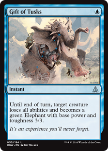
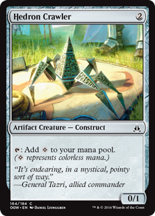
K: It is not an exaggeration for me to say that Gift of Tusks may have some of my favorite flavor text ever. It’s subtly, clever, and very funny. These cards that embrace blue’s polymorphic identity have some of the highest hit rates, honestly. If you tell me I’m a wizard, you bet I want to turn some stuff into elephants or frogs or dragons. The illustration, the name, and the mechanics all work well together, and the relatively minor in-game impact the card has is the only thing keeping it from being among the best in the set. Hedron Crawler gets an honorable mention with some on-the-nose commentary from General Tazri. Who would’ve thought she had a sense of humor.
T: Gift of Tusks is clearly the winner by a six-foot nose. I don’t know if flavor text is ever secretly submitted by famous writers, but I’m pretty sure Hedron Crawler‘s flavor text is a direct quote from Buffy the Vampire Slayer. I’ve always said, Joss Whedon is so talented he should be writing flavor text for Magic: the Gathering cards.
The Ancient Grudge Commemorative Worst Flavor Text Award
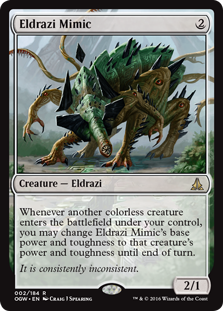
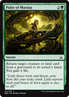
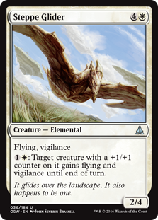
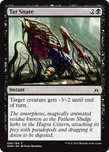
K: You know how I said I liked most of the attempts to express the unknowability of the Eldrazi? The Mimic here is a notable exception. This is a phrase that doesn’t mean anything and for me unfortunately evocative of Donald Rumsfeld’s line about “known unknowns.” Steppe Glider is an attempt at a dumb joke that falls completely flat (much like his titular landscape). It relies upon my acceptance of the premise that we’re now reduced to making elementals of steppes, nevermind and that those steppes are flying for some reason, and also have a bit to do with +1/+1 counters. Pulse of Murasa proves once again that you shouldn’t reach beyond your skill level, and that flavor text written in rhyming couplets is a little ambitious. It’s especially odd that this is a quotation that isn’t attributed to anyone. I guess this is the incantation you just have to say when performing a Murasa-style dead-raising. However, the worst flavor text of the set in my opinion is on Tar Snare. It features a potent mix of proper noun salad and unnecessary SAT words, all in the name of delivering a factoid best described as “who could possibly care?” Among the worst we’ve seen lately.
T: Landscapes soaring in the distance
Bad is worse than inconsistent
Tar Snare’s known as Fathom Sludge
So why not name it Fathom Sludge?
Best Name
T: It’s a good thing this card has such a sweet name and matching rules text, because the artwork looks like a parrot being sucked into a food processor. I’d expect the appearance of at least an electric guitar of some sort.
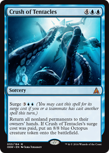
K: My pick for best name would also be at home on a Metal album cover. I guess just call me Kiora, cause it’s hard for me not to love a card that makes an 8/8 octopus token.
Worst Name

T: Since Pulse of Murasa had flavor text in verse, this one deserves a limerick:
There once was a trusty lagac
With saddles attached to its back
Raff liked to ride
But sadly it died
And now he has only a snack

K: It looks like their well-worn Eldrazi naming scheme of two words that don’t usually go together has finally fallen apart, and not a moment too soon. If they had to name just a few more we might’ve ended up with Truthful Liar or Hideous Hot Babe.
Best New Use of an Old Name

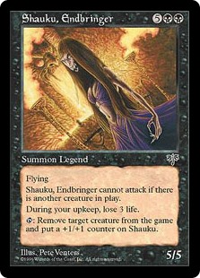
T: Shauku looks wicked different without her wig on. Which of these minor value-generating abilities do you think is the “endbringing” they’re referring to?
Achievements in Design
Best Overall Flavor
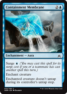


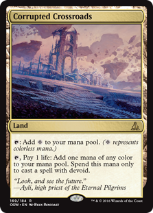
K: This is highly unusual, Jesse T, but I think I’m ready to declare not just a single card, but a design concept as the winner of this contentious category. I’m giving it to the Visual Callback. Whether it’s the transformation of Kabira Crossroads into Corrupted Crossroads, a Containment Membrane over a Cup Island, or even just World Breaker rampaging through a Zendikari-syle Hallowed Fountain, I appreciate the sense of continuity and unification it gives the world. It actually goes beyond that and helps the world feel more connected to the original Zendikar that I felt was somewhat missing from BFZ. This kind of thing requires effort and attention to detail, and represents willingness to go above and beyond in the creative sense. Specific cards I really like include many of The Legends. Ayli, Eternal Pilgrim, General Tazri, Mina and Denn, Wildborn are all solid legends with coherent concepts communicated well, but Kozilek and Kalitas both stand out as just fantastically designed. Somewhat controversially, I also really like Hedron Alignment. It’s a way that creates a the feeling of being part of a story moment with gameplay exclusively, which is a rare feat to accomplish. Gotta get those Hedrons aligned juuuuust right.
T: Oh, totally! Hedron Alignment is great. There aren’t that many slam-dunks in this set, unfortunately, especially compared to some of the juicy mythics we saw in Magic Origins. Hedron Alignment is one of the few cards that feels like it’s there to tell a story, and not just to get the number of colorless mana sources in the set to critical mass. I think the entire setting of Zendikar suffers from a lack of distinction, personally. Compared to Innistrad, Theros, and Tarkir, a D&D-style adventure world just feels kind of generic. The visual callbacks to cards from the original Zendikar are definitely one of this set’s strengths, assuming that Zendikar is somewhere worth revisiting in the first place. Here’s hoping to see plenty more in Shadows!
Worst Overall Flavor
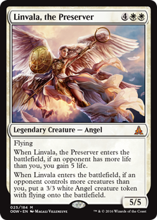

K: Linvala stands out to me as a counter-example to the overall trend of flavorful, interesting legends. It feels designed by committee to create a powerful, standard playable mythic (and it doesn’t appear to have even succeeded at this), without any connection to a character or even a gameplay experience. Aside from taking the character a few steps down in uniqueness, I’m also kinda over the whole pants-less angel thing. Despite my dislike of the card, Linvala’s not my least favorite thing about the set. That falls to the high number of planeswalker-referencing cards at lower rarities. I get why they had to do this, and like the concept of each of the planeswalkers having an oath card. However, the fact that they directly reference the mythics, and often do little without them, has got to create feel-bad experiences for players basically across the board. Whatever good comes from showing the moment of creation of The Gatewatch here is overshadowed by the clunky execution. This could’ve been done in a less frustrating way, like perhaps having 4 cards with the names on them that work well with their respective planeswalkers. You know, like in those core sets.
T: “Planeswalkers matter” is just about the worst theme I can possibly think of for a set, unless they’re planning to start printing planeswalkers at lower rarities and making them an actual part of the game. I hated the Oath cycle, and probably played less of the set because of it. Look at Oath of Jace, for example. It’s not even good when you have planeswalkers! Scry X? Where’s my incentive to make bad decisions surrounding this card? To be honest, I’m kind of hoping that Oath was just there to set the bar nice and low so they can really blow us away in the spring. Overall, I’d say the block was a solid C. It wasn’t amazing, but it wasn’t terrible either, and it that way, it’s already kind of lived up to the legacy of its predecessor.
K: To me this set was slightly disappointing, but probably only because I had such positive feelings for the original Zendikar and Rise. As many thing worked as did, and there were some genuine hits mixed throughout. Without the warm light of nostalgia, I can settle for calling this set average.
T: As always, we appreciate everyone who enjoys/hates our work, and we thank you for reading! Oh, and of course…
Best Card to Put at the End of a List

You can find the Two Jesses on Twitter @TwoJesses.