
Jesse T: The Eldritch Moon may loom on the horizon, but there’s something else with the same initials we need to introduce you to first. That’s right: It’s time to play Eternal Masterpiece or Disasterpiece! Forming your own opinions can be difficult, time-intensive, and emotionally draining. That’s why we’re going to look at some of the cards that have received facelifts in Eternal Masters, and use our collective flavor expertise to let you, the audience, know whether the artwork is better or worse than it used to be. Jesse K and I have been playing this game basically forever (and will continue to do so as part of an unholy pact forged with a Lord of the Pit back in 1996), so we know what’s up. Sit back and enjoy, or express your outrage in the comments!
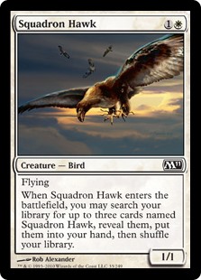
T: Squawk! Just kidding, I’m a human being. Squadron Hawk is one of the few white cards to be reinterpreted in this set. Normally if you want to make something hip, you just put a bird on it, but what do you do if that thing is already a bird? It looks like the answer is to cover it in barnacles! The original artwork clearly showed a perfectly reasonable hawk and three backup hawks. A bronzed bird wearing armor would have a really tough time flying. I think this spiny metallic thing is a DISASTERPIECE.
Jesse K: The original Squadron Hawk art looks like Ron Spencer used a rotisserie chicken as his model. It hovers inertly with its weird open beak and askance legs. At least the new one looks a bit dynamic. I will remind my colleague Jesse T that we are mighty Wizards and that a somewhat magical looking bird is ok sometimes. Plus I love the background. I’ll call this an UPGRADE.
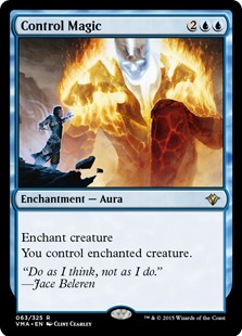
K: Although I think it’s cheating a bit to ask me if I prefer an illustration featuring Jace: Worst Planeswalker, I have to say the Alpha version is not much better. The old art not only features a character I actively don’t care about, but he’s control magicking a monster that I can’t really identify. What is that, a Cinder Giant? Be careful, Jace, that’ll kill you during your next upkeep if you’re not careful. The new art, by contrast, is super awesome, as you would expect from a Terese Nielsen piece. Definite UPGRADE.
T: Anything is an improvement over gratuitous Jace placement. He normally wears a cowl (the “my mom just doesn’t understand me” hoody of the high fantasy multiverse), and it’s easy to see why with that Eastbound & Down mullet he’s apparently been hiding. It’s not particularly clear to me how a glowing eye and a tiny dragon represent mind control in the new artwork, but the guy’s beard really makes his lips pop like Dave Navarro’s, so I guess that’s a MASTERPIECE.
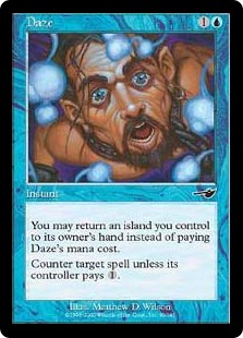
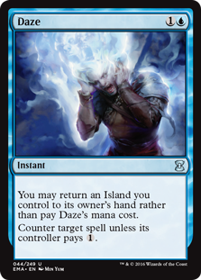
K: Clearly the new art is just a disused art for a discard spell with a blue filter laid over it. It features the classic ‘clutching my head in pain’ indicator. This guy doesn’t look dazed, he looks agonized. This might be closer to the face your opponent makes when you get ‘em with this card, but Matthew Wilson’s classic Daze art captures the expression perfectly, even if it does feature a shirtless BDSM hobbit. DOWNGRADE.
T: For such a simple, commonly-used word, Magic has had a very difficult time coming up with an adequate illustration for it. We’ve had to settle for this drawing of a pirate in a gloryhole for a while, and I’m sure everyone who plays blue in Pauper was really looking forward to a change. Unfortunately, even though the new artwork is more detailed and better-looking, the old artwork at least shows someone who looks dazed, as opposed to someone discarding two cards from his or her hand. This is a DISASTERPIECE.
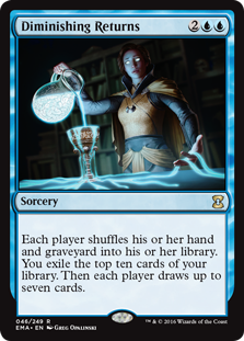
K: Sure, the new art is technically better in every way, but I have a real soft spot for the green ghost and his glowstick. The new one is a perfect example of over-use of visual metaphor, and I hate it. A glowing pitcher of brain liquid is enough for me to know that this art is a DOWNGRADE.
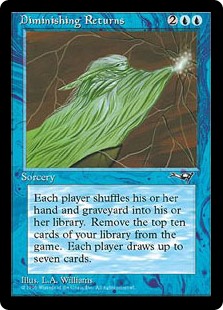
T: If you ask me, they should have saved this name for a card that puts a creature from the graveyard into play, but it gets -1/-1 for each Diminishing Returns you’ve already cast. Neither of these visual metaphors is very good, but I’m going to disagree with you and favor the one that at least makes some sense. A vedalken wizard using an enchanted goblet to turn Kool-Aid into Fruit by the Foot has got to be a MASTERPIECE.
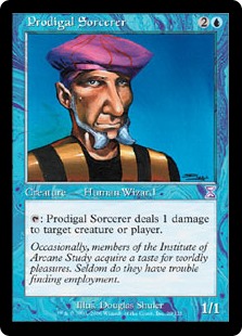
T: I didn’t think Tim could get any uglier. Look at those beady little eyes and that 5 o’clock shadow! Remember, kids: Never cut your own bangs, and always get a second opinion about chest tattoos. Just because this is a DISASTERPIECE doesn’t mean it can’t also be a teachable moment.
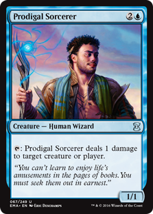
K: I hear what you’re saying, Jesse T, but boy that original sure is terrible in the sober light of adulthood. Gold and black robes? That facial hair? A big ol’ fuck you to the concept of backgrounds? And to top it all off with a pink beret, I have to assume the artist was motivated mostly by spite for their eventual consumers. At least the new Tim looks like he actually earns the descriptor ‘prodigal’. UPGRADE, but still not art that I’m thrilled with.
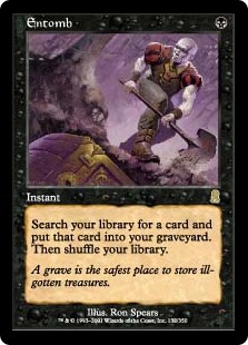
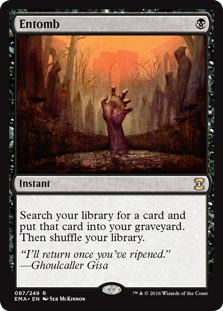
K: DOWNGRADE. I appreciate the new spin on the flavor from Ghoulcaller Gisa, but you can’t just show something popping out of a grave on a card called Entomb. Another card where there was a clear opportunity for improvement, but it loses on a flavor technicality. Tsk tsk.
T: The new artwork has beautiful symmetry and more cohesive color palette, but I am Dazed and Entombed by the content. Unless someone was buried so hastily that their hand was left sticking out, the definition of the word entomb has been grossly miscommunicated. On the other hand, the card Entomb is an instant, so maybe this is a MASTERPIECE after all.
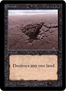
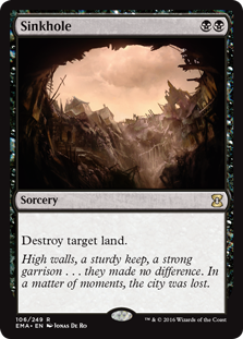
T: Sinkhole hasn’t changed since Alpha, but I really like the new flavor text. It makes land destruction feel like a black spell by linking it to rot and decay from within. Not only is the artwork better, but I now have a natural segue to discuss the dangers of fracking with other players at my next FNM. This MASTERPIECE was worth the wait!
K: Sinkholes are one of my favorite natural phenomena and now they finally have Magic art worthy of them! This is a straight UPGRADE, which is generally not hard to do when you’re contrasting with some of the game’s earliest art. I’m pretty sure the art description for the original was something along the lines of “Please draw a sinkhole”. I appreciate that the new one maintains the mood and color palette of the original and didn’t take it in a whole new direction, letting it feel both new and classic.
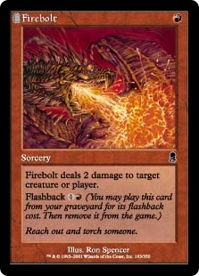
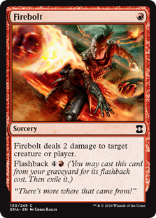
K: God this is such a DOWNGRADE. Ron Spencer’s an artist who was only really at home drawings reptiles or bugs, but he knocks this one out of the park. The choice these two illustrations ask me to make is whether I’d rather be a weird digital art-ified Ghitu Slinger or a sweet-ass dragon. The flavor text is even better on the original.
T: I agree. Dragons are sweet. The guy in the new artwork is ugly and I hate looking at him. A sweaty dude with a ponytail is definitely a DISASTERPIECE.

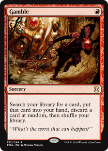
K: This is an UPGRADE to me. I love that you actually get to see the titular Gambling on the new art. What’s happening on that original anyway? What exactly was that goblin going to gain from jumping off that cliff? The flavor text is also poor on the original, as the exact worst time to cast Gamble is when you’ve got nothing else. You’re just going to guarantee you discard whatever you got!
T: The new artwork is clearly superior to the old sketchy goblin poetically strangling itself on its own purse by every metric. I don’t know if a crowbar is anachronistic, but this might be the first time I’ve seen one in a fantasy setting. The thief using her +1 Bar of Prying to jimmy a giant 20-sided die off of a statue is a solid MASTERPIECE.
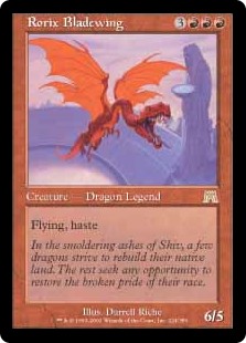
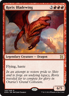
K: Hashtag Not My Rorix. I feel like if you’re going to do a new illustration of a legendary creature, you have to be somewhat beholden to what the original character looks like. It’s not like these other creatures where you can say ‘this is another plane’s version’, since there is by definition only one of this character (well, maybe 2). I like the old art better anyway. To me he’s got a lot more personality in the old one. I don’t believe this new dragon has any thoughts or goals at all, since he looks like a big dumb monster who smashes into things. DOWNGRADE.
T: I didn’t hear anyone complaining when they did the exact same thing with Nicol Bolas. Now he looks like those racist Siamese cats from Lady and the Tramp. I like that they gave Rorix a thicker neck, but they went a little too far to the opposite end of the spectrum. Now he looks like one of those meathead jock dragons who used to pick on Rorix in high school and tell him he’d never be a famous Magic writer on the Internet. Look at me now, you scaly homovores! By the way, Jesse K, you don’t have to actually write out the word #hashtag anymore. You just #hashtag it.

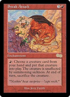
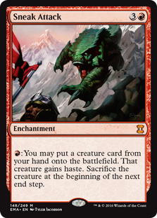
T: They finally fixed sneak attack! The card allows you to put a big threat from your hand into play with haste, so the illustration of a bunch of soldiers quietly ambushing a sleeping dragon completely misses the intent of the card completely. The art now features a giant frog with the face of a gorilla getting the drop on an unwary security guard, making it a relative MASTERPIECE in my opinion.
K: I hear you, but I have a real soft spot for this nostalgic classic. Besides, you can’t argue that that Urza’s Saga art doesn’t depict a sneak attack. While the new art might be more in line with how the card functions, to me it doesn’t look particularly sneaky. Besides you miss out on some all-time great flavor text. For this reprint to have succeeded it would’ve needed a flavor callback to the original, like maybe a dragon sneaking up on some sleeping goblins. DOWNGRADE!
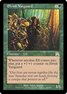
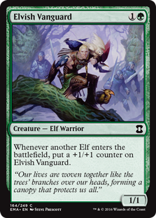
K: I love it! Sure the new art seems to imply that the Elvish Vanguard’s strength come not from the other elves, but from an increasingly diverse group of exotic birds, but what is this set for if not recontextualizing? The old art is muddy and dull, and this is a big UPGRADE for me.
T: Maybe the birds represent +1/+1 counters. To be honest, I can’t really tell what’s happening in the original artwork. It just looks like a bunch of brown and green smudges, and I’m not sure which ones are trees and which ones aren’t. It must be like one of those Magic Eye posters, which are cool, but not ideal for a 2.5″ x 3.5″ card. Discernible figures in the artwork make this a MASTERPIECE.
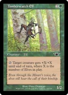
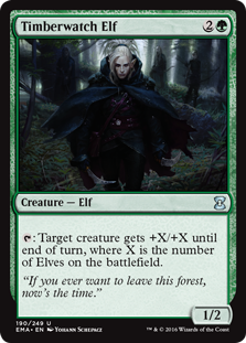
K: One thing I like about the new art in this set is it manages to recontextualize some creatures from very visually distinctive original sets. Timberwatch elf, for example, is super weird and green looking because he’s been warped by the energy of the Mirari. I like how the new art shows a different, perhaps more traditional version of a timberwatch elf. The lurking elf crew in the background even manage to depict how this guy’s gonna make all your creatures unfairly huge. UPGRADE for me.
T: That must be why I couldn’t identify the Elvish Vanguard. Rather than the traditional humanoid elves found in many mythologies from all over the world, the elves of Onslaught Block were little green men who lived in the forest and couldn’t be distinguished from the background. The new Timberwatch Elf is way cooler, and his cloak really screams, “my mom just doesn’t understand me!” Clear MASTERPIECE.
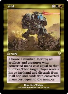
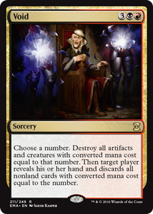
T: If a crowbar is anachronistic, what do you call a mecha suit with laser cannons and a giant crab claw? Void’s original artwork is some of the most bizarre and inexplicable in Magic‘s history. As cool as lasers and old-timey diving suits are, the first piece of feedback I would give the artist is that the picture does not include the titular void. The new artwork, while still not perfect, at least features something disappearing into empty space. This is a badly-needed MASTERPIECE.
K: It’s tough, because the original art is much cooler in a vacuum (or a void, if you will), but it is entirely out of place with 99% of this card game’s aesthetic. Void’s original printing looks like some Warhammer 4k art got mistakenly put on a Magic card. It doesn’t help that what is depicted doesn’t look anything like a) a void or b) what the card does. I’ll give it an UPGRADE, but it’s the kind of upgrade you get from going to a D to a C.
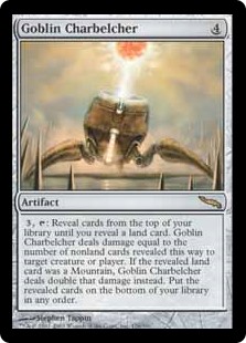
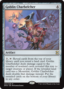
K: The original art might be cooler and more iconic to me, but let’s be honest, this is not a machine made by goblins. The new art captures the goblin philosophy and lifestyle a lot better, and even manages to depict what the card does in an interesting way. Check out all those Magic cards the goblin is dumping into the charbelcher. Where does he get this stuff from? Doesn’t he know he could sell that black lotus and get a nice used car? Unanswered questions aside, this is an UPGRADE.
T: The new artwork is way more interesting and detailed, but a charbelcher is a machine, not a job title. The goblin is the focal point of the new artwork, and it’s hard to even see the charbelcher! The Black Lotus is cute, but the original artwork communicates what the card does much more clearly, even if it does look like advanced Protoss technology. I think this is a DISASTERPIECE, or a neutral change at best.
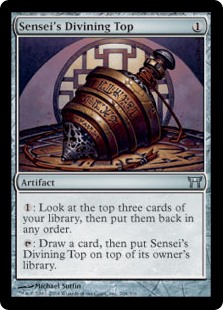
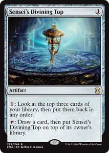
K: I guess in a different world the one doing the divining is a cyber-sensei with a scout droid top. I guess if that’s your thing, have at it, but I’ll stick with the old art, which clearly indicates a sense of ‘oops, we didn’t know this card was good’. Not a fan of visible ‘magic waves’ emanating from artifacts either. DOWNGRADE.
T: Ugh. Agree. This looks more like a Voltaic Key to me. It’s a good thing I already know what a top is, because if the only thing I had to go on was the new artwork, I would assume it was some sort of maraca-like instrument, or maybe a scale model of the Space Needle. They say if you spin a top and it never stops, it’s a sign you’re having a dream, but I think it just a sign of a DISASTERPIECE.
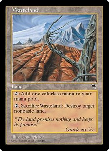
T: More so than the art, I’d like to discuss the colorless mana symbol on this card. As you’re all doubtlessly aware, Magic Online changed all the colorless mana symbols on cards to little diamonds after Oath of the Gatewatch was released. I’m not complaining about the change per se, but if they’re going to retroactively alter the faces of my old cards, it’d be nice if they could make all the old core set cards black-bordered while they’re at it. Until Blood Moon matches the rest of the cards in Modern, wingdings are a DISASTERPIECE.
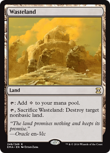
K: I think the new art for Wasteland is really well done and much truer to the card’s nature. The old Wasteland doesn’t even look that desolate! It’s really more like foothills than a wasteland. And although destroying a City of Brass is probably not going to come up in most games of Vintage, it’s certainly technically possible. I’ve come to accept the new mana symbol fairly easily, but I guess that might just be because I’m already acclimated to adding tiny skulls and drops of water to my mana pool. And if you’re complaining about the wingdings here, imagine how much worse it could’ve been if they decided to try to tie the new identity of Wasteland to the Eldrazi-themed Wastes. Dang that would’ve been a really bad look. UPGRADE overall to me.
T: Eternal Masters has been a really exciting set. There are so many cards with new art that we didn’t even get to touch on all of them! Even if/when they’re terrible, I love seeing new takes on old ideas and watching Magic change over time unless it includes Jace. Like a Wasteland, we promised you nothing, and we delivered. Let us know what your favorites and most-despiseds are in the comments!